Preview image. Unlock full-res
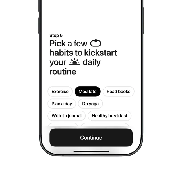
Mobile app onboarding screen (Step 5) for a habit-building app, using monochromatic pill-shaped selectable buttons (Exercise, Meditate, Read books, Plan a day, Do yoga, Write in journal, Healthy breakfast) with one pre-selected state and a primary CTA button.
Summary
Step 5 of a mobile habit onboarding flow where users select habit preferences from a grid of touchable pill buttons, with "Meditate" pre-highlighted in solid black and the rest in light outlines.
Visual description
A vertical mobile screen (likely iPhone 12+ proportions) with step label "Step 5" at top and headline "Pick a few habits to kickstart your daily routine" in large, bold sans-serif. Below is a loose grid of seven rounded-rectangle pill buttons: six outlined in light gray ("Exercise", "Read books", "Plan a day", "Do yoga", "Write in journal", "Healthy breakfast") and one filled solid black ("Meditate"). All buttons use black sans-serif text; the selected button inverts to white text on black. A large full-width primary CTA button labeled "Continue" sits at the bottom of the viewport, also in solid black. Background is off-white, with minimal visual chrome (thin phone bezels visible at top and bottom).
Key takeaway
The pill-shaped multi-select pattern clearly shows which habits are available and which is currently chosen. The solid black highlight on the selected option is instant visual feedback without a checkbox icon. One pre-selected default ("Meditate") reduces cognitive load for users who want to skip customization. The single large CTA below keeps the flow linear and mobile-thumb-friendly.
Reuse notes
Ideal for wellness, productivity, and health apps that onboard users incrementally. Works well when you expect users to choose one to three items from a longer list. Keep pills to 1-2 lines; if more than 8 options, consider a scrollable or tabbed variant instead. The "continue" language suggests this is not the final step, so signal what comes next or allow back/skip options if users get stuck.
More like this
Keep what you find
A free account saves references to boards and can send you a weekly email of picks based on what you save.
To see every result, go Pro.