Preview image. Unlock full-res
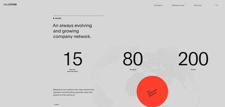
Three-column statistics layout with a bold red concentric-circle accent, communicating network growth and scalability.
Summary
Three-column statistics layout with a bold red concentric-circle accent graphic, emphasizing network growth and business scale for B2B positioning.
Visual description
Light gray background with a minimal navigation bar at top. Body text introduces the company narrative. Three large display numbers (15, 80, 200) are arranged horizontally with supporting labels below (Resource Sharing, Programs, Partners). To the right of the statistics sits a striking accent: concentric circles in subtle gray radiating outward, overlaid with a solid red circle containing white rotated text. Small body copy below the graphic elaborates on the service model. The layout balances data-heavy typography against negative space, with the red accent providing focal emphasis.
Key takeaway
The concentric-circle motif suggests growth, networks, and radiation of influence without explicit explanation. The single bold red accent against a neutral palette creates visual hierarchy and draws attention efficiently. Large statistics paired with minimal supporting text optimizes scannability for busy audiences.
Reuse notes
Strong for B2B positioning, network services, or SaaS growth narratives. The three-column statistics layout scales well in hero or features sections. The concentric pattern works best when the accompanying copy describes something iterative or expanding. Reserve the red accent for the single most important metric or message.
More like this





Keep what you find
A free account saves references to boards and can send you a weekly email of picks based on what you save.
To see every result, go Pro.