Preview image. Unlock full-res
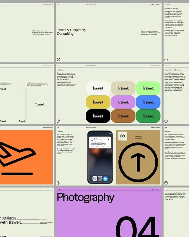
Travel brand guideline reference showing modular color palette, logo usage, and structured typography system in a grid-based layout.
Summary
A travel & hospitality consulting brand guideline showing modular color swatches, logo lockups, photography section, and grid-based brand system pages in a structured reference layout.
Visual description
Multi-page brand reference displaying the Trawell identity system across nine grid cells. Top sections show brand headline with supporting text, color swatches arranged in a 3x3 matrix (yellow, purple, black, brown, teal, green, gray, lilac, neon lime) with the logo name overlaid, and typography guidelines. Middle panels include a simplified airplane icon on an orange ground and a dark app interface mockup. Bottom section features a large magenta field with "Photography" as the primary heading and a bold "04" numeral in black, setting up a photography guidelines section. Throughout, pale background color blocks separate each cell, and thin gray borders frame the grid. Type is small sans-serif, consistently left-aligned and sparse, emphasizing white space.
Key takeaway
The modular color-swatch grid (equal-size cells, clear hierarchy via text overlay) as a template for brand guidelines. The restraint: photography section signposting uses color blocking and scale rather than decorative imagery. The grid structure makes every guideline section equally browsable without hierarchy distraction.
Reuse notes
Reference for organizing brand guidelines, color systems, and typography rules in a single-view layout. Works well for B2B or consulting brands. The grid format suits printed references or PDF guides. The sparse type treatment keeps focus on the system itself rather than descriptive copy.
More like this



Keep what you find
A free account saves references to boards and can send you a weekly email of picks based on what you save.
To see every result, go Pro.