Preview image. Unlock full-res
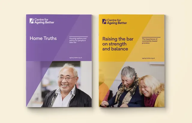
Two split-layout brochure covers for a nonprofit using complementary purple and gold angles, white sans-serif type, and warm portrait photography.
Summary
Two study covers for a UK aging-services nonprofit, each split by a bold angled color block with a portrait photo and white sans-serif title overlaid.
Visual description
Left cover: a lavender-purple angled block fills the upper two-thirds, with white wordmark and headline "Home Truths" in sans-serif at top-left, plus supporting text. A portrait of a smiling senior man in glasses occupies the lower third. A subtle shadow beneath the color block adds depth. Right cover: a gold-yellow angled block mirrors the left, with headline "Raising the bar on strength and balance" in dark sans-serif, smaller supporting text, and a portrait of two seniors smiling together below. Both backgrounds are a soft warm cream. The wordmark "Centre for Ageing Better" appears consistently at the top of each cover, and the URL "ageing-better.org.uk" sits in the lower corner in small dark type. The angled division creates visual balance and suggests forward motion.
Key takeaway
The bold angled color block as a primary compositional anchor, keeping the design dynamic without complexity. The careful pairing of warm complementary colors (purple and gold) that convey authority and optimism without feeling corporate or cold. The placement of portrait photography in a restrained lower portion, allowing type to breathe in the upper half.
Reuse notes
Well-suited for nonprofit, healthcare, or community-service branding where warmth and expertise must coexist. The angled split works especially well for paired covers or a series. Avoid over-crowding the colored blocks with secondary information; the whitespace is part of the design's trustworthiness. Effective at small print sizes due to strong color contrast and readable sans-serif weight.
More like this





Keep what you find
A free account saves references to boards and can send you a weekly email of picks based on what you save.
To see every result, go Pro.