Preview image. Unlock full-res
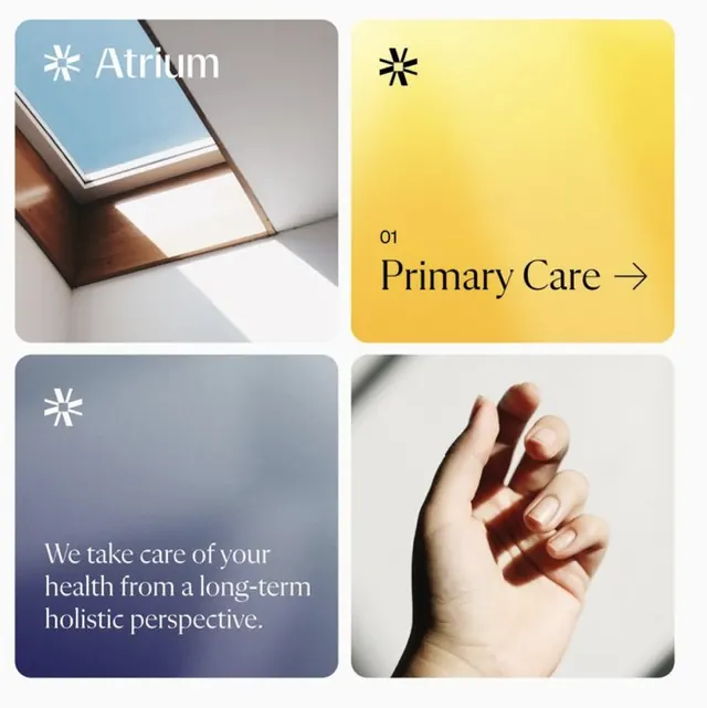
Wellness and primary care branding using a four-quadrant modular grid with warm yellow, cool slate blue, and photographic elements to communicate holistic health services.
Summary
A four-quadrant healthcare branding system balancing warm yellow optimism with cool blue trust, using modular layout and photography to present holistic wellness services.
Visual description
Top-left: ceiling/skylight detail with "Atrium" logotype in white sans-serif on muted teal background. Top-right: bright yellow quadrant with centered "Primary Care" arrow icon in sans-serif. Bottom-left: slate blue background with white sans-serif text describing a long-term holistic health perspective. Bottom-right: close-up photograph of hands in care/support gesture. A small white six-pointed star icon anchors the lower-left. The palette alternates warm yellow and cool blue, with photography introducing human touch against graphic elements.
Key takeaway
The four-quadrant modular structure for presenting service categories or care pillars. The pairing of opposites (warm/cool, graphic/photographic, text/image) to communicate both optimism and trustworthiness. The star icon as a minimal, reusable symbol connecting color blocks.
Reuse notes
Ideal for healthcare, wellness, and mental health brands. The yellow-blue contrast works for both primary and specialty care. The modular grid scales to 6, 9, or 12 quadrants easily. The photo placement grounds abstract messaging in human experience. Best for brands seeking to balance positivity (yellow) with professionalism (blue).
More like this








Keep what you find
A free account saves references to boards and can send you a weekly email of picks based on what you save.
To see every result, go Pro.