Preview image. Unlock full-res
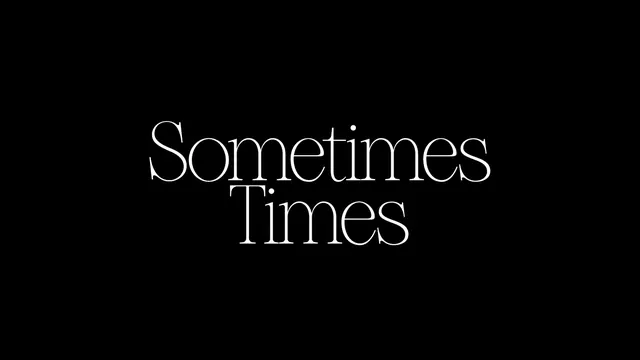
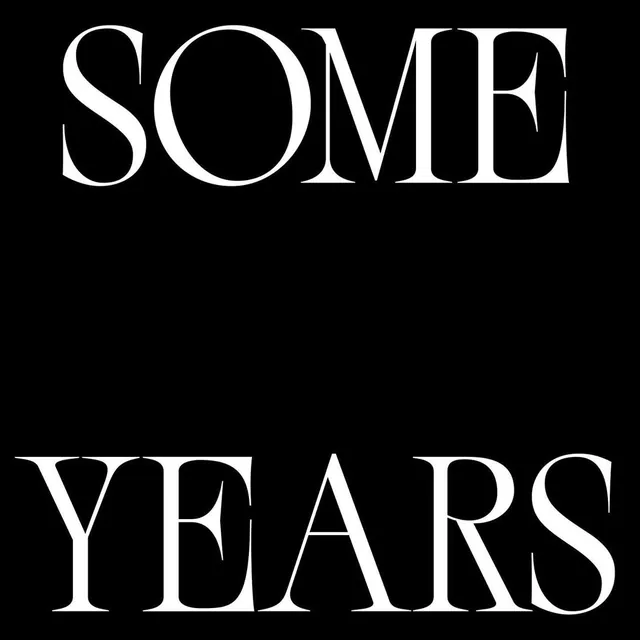
Black field with centered white Sometimes Times set in a high-contrast serif across two lines.
Summary
Minimal type specimen showing Sometimes Times in white high-contrast serif on pure black.
Visual description
Pure black canvas with two centered lines: Sometimes above Times. The face has thin hairlines, thick stems, and sharp serifs with tight kerning. Generous black margin surrounds the small text block, making the letterforms the entire composition.
Key takeaway
Extreme negative space plus a delicate high-contrast serif sells elegance without ornament or secondary copy.
Reuse notes
Font marketing, editorial mastheads, or luxury wordmarks where the typeface itself is the hero. Requires a strong serif with visible contrast.
More like this


Keep what you find
A free account saves references to boards and can send you a weekly email of picks based on what you save.
To see every result, go Pro.