Preview image. Unlock full-res
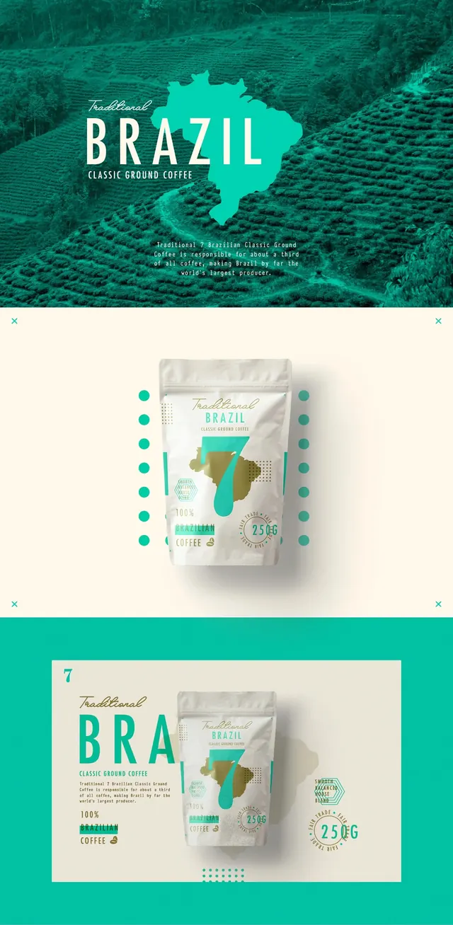
A brand identity and packaging design system for coffee, featuring a map of Brazil and a teal color palette.
Summary
A brand identity and packaging design system for coffee, featuring a map of Brazil and a teal color palette.
Visual description
The design uses a duotone teal and cream color scheme applied to photographic backgrounds of coffee plantations. A stylized teal silhouette of Brazil serves as a central graphic element on both the posters and the coffee pouches. Typography mixes a large, bold sans-serif 'BRAZIL' with elegant serif accents.
Key takeaway
Using a single iconic silhouette as a recurring graphic element across different media creates strong brand recognition.
Reuse notes
Use this approach when designing premium food packaging that needs to communicate origin through simple, bold iconography.
More like this


Keep what you find
A free account saves references to boards and can send you a weekly email of picks based on what you save.
To see every result, go Pro.