Preview image. Unlock full-res
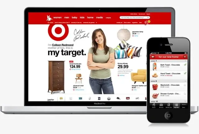
A digital mockup showcasing a retail website on a laptop and its corresponding mobile application on a smartphone.
Summary
A digital mockup showcasing a retail website on a laptop and its corresponding mobile application on a smartphone.
Visual description
The composition features a silver laptop displaying a retail website with a red header and a central photograph of a woman, alongside a black smartphone showing a mobile shopping list. The layout uses a clean white background for the web interface, accented by red branding and product images like a wooden dresser and a yellow chair. The mobile screen uses a red header bar with white text and small product icons.
Key takeaway
Use a consistent color palette and branding elements across different screen sizes to ensure a seamless cross-platform user experience.
Reuse notes
Use this layout when presenting a responsive design system that needs to demonstrate how a brand translates from desktop to mobile.
More like this



Keep what you find
A free account saves references to boards and can send you a weekly email of picks based on what you save.
To see every result, go Pro.