Preview image. Unlock full-res
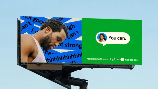
An outdoor billboard advertisement split vertically into blue and green halves, pairing photography and bold typography to promote mental health coaching from Headspace.
Summary
A high-impact billboard using a vertical split composition: blue left panel layered with fragmented positive affirmations and a portrait of a man; bright green right panel with a rounded voice bubble saying "You can." and text for Headspace mental health coaching.
Visual description
Bright sky-blue background on the left side contains fragmented white and blue text in various sizes, including phrases like "I can't good" and "I can't strong" arranged diagonally, overlaid with a color-treated photograph of a man in a white tank top gazing downward with a thoughtful expression. The right half shifts to a vibrant kelly green, featuring a small circular white avatar photo of a woman at the top, a rounded white speech bubble containing "You can." in bold sans-serif, the Headspace logo, and descriptive text "Mental health coaching from headspace" in white sans-serif. The composition uses extreme color contrast and typography contrast to command attention from a distance, balancing the emotional weight of the portrait with the affirming call-to-action on the right.
Key takeaway
The vertical split cleanly separates visual content (portrait, affirmations) from messaging (call-to-action). Layering fragmented text over the portrait creates visual rhythm and depth without cluttering. The rounded voice bubble appears conversational and approachable against bold typography. Bright complementary colors (blue-green split) ensure legibility and emotional impact at highway speeds and distances.
Reuse notes
Excellent for public health campaigns, mental health awareness, subscription service launches, and crisis support promotions. The split composition scales well to billboard and digital formats. The portrait should be diverse, relatable, and convey the target emotion (contemplation, hope). Works best when affirmations or anxieties resonate with the audience segment. Green as the action color creates a positive, growth-oriented feeling. Avoid overloading either side; the split composition only works with clear information hierarchy.
More like this



Keep what you find
A free account saves references to boards and can send you a weekly email of picks based on what you save.
To see every result, go Pro.