Preview image. Unlock full-res
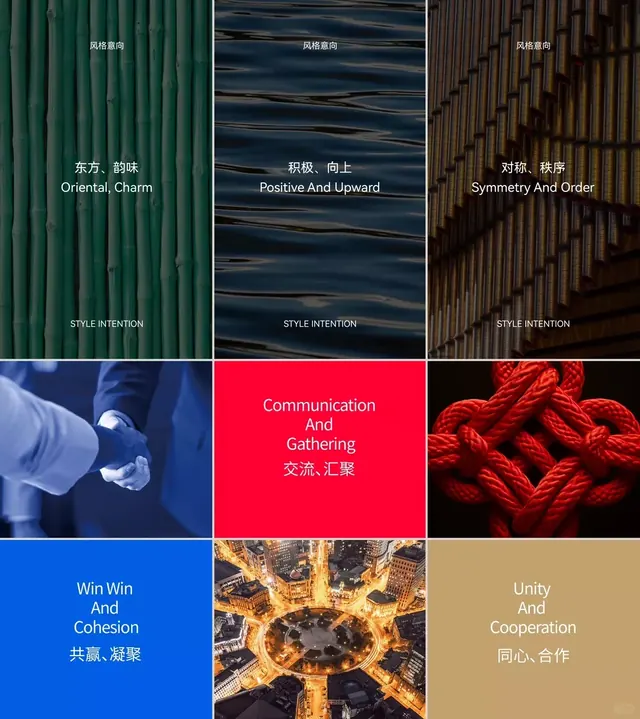
A 3x3 grid mood board expressing organizational values through textural photography and symbolic imagery, with bilingual (Chinese and English) conceptual labels paired to each visual.
Summary
A strategic mood board arranged in a 3x3 grid, pairing six conceptual values (Oriental Charm, Positive and Upward, Symmetry and Order, Communication and Gathering, Win Win and Cohesion, Unity and Cooperation) with symbolic photographs and textural imagery, each labeled in both Chinese and English.
Visual description
Top row: three vertical texture studies (ridged green material, dark water with horizontal striations, golden-brown gridded surface), each captioned with an abstract concept in bilingual text and marked "STYLE INTENTION". Middle row: three image panels (blue-toned hands clasping, bright red background with centered white type, deep crimson knotted rope detail). Bottom row: three panels (solid blue field with white type, aerial night cityscape with concentric circles, warm tan-beige field with white type). The rigid 3x3 grid maintains unity while the photograph selections and color shifts create visual variety. Typography in clean sans-serif white, centered, uses consistent sizing and weight throughout. The overall palette shifts from cool greens and blues in the top third to warm reds and golds in the middle, settling into cool and neutral tones below.
Key takeaway
The pairing of abstract organizational values with specific photographic imagery creates a visual language for what could remain purely conceptual. The 3x3 grid combined with consistent typography treatment provides structure without rigidity. Using textural close-ups alongside symbolic photography (hands, rope, cityscapes) makes the brand philosophy feel grounded and intentional. Bilingual text treatment shows how to integrate multiple languages into a cohesive design system.
Reuse notes
Ideal for corporate identity systems, nonprofit mission communications, and global organizations needing to express values across cultures. The mood-board approach works well as a design system reference, brand guide section, or internal communication asset. Each cell could be applied independently as a social media card or presentation slide. The bilingual approach scales well for organizations with multilingual audiences. Avoid this layout if the values or supporting visuals cannot sustain equal visual weight across all nine cells.
More like this


Keep what you find
A free account saves references to boards and can send you a weekly email of picks based on what you save.
To see every result, go Pro.