Preview image. Unlock full-res
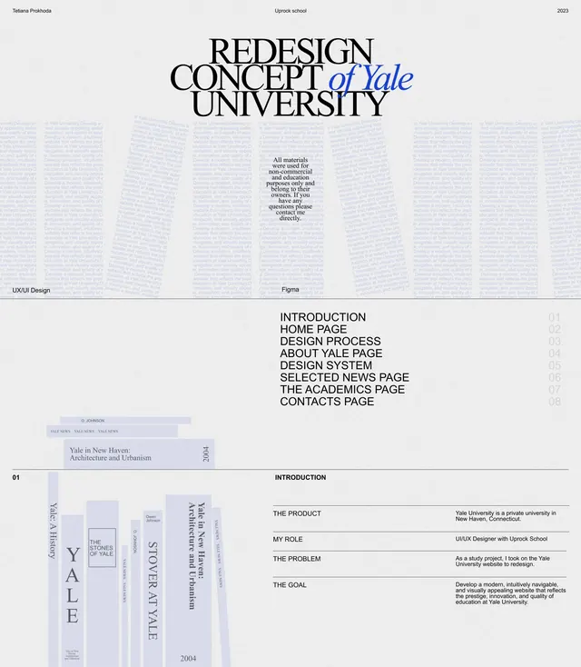
Editorial design case study for Yale University redesign using overlapping sans and serif typography, with structured layout and blue italic script accent.
Summary
Case study document for Yale University redesign showcasing a typography-heavy layout combining stacked serif and sans-serif headlines with blue italic script accents on pale grey background.
Visual description
Multi-page spread documenting a university redesign project (Unyok School, 2023). Top section: large stacked headlines reading "REDESIGN CONCEPT of Yale UNIVERSITY" with the word "of Yale" in blue italic script breaking the sans-serif structure. Center: a grid of pale thumbnail pages showing design system documentation (pages labeled Introduction, Home Page, Design Process, etc.) with rotated axis layouts. Bottom left: vertical spine text reading "YALE" and "STORY OF YALE" in serif stacked vertically. Bottom right: introductory text blocks defining the problem, goal, and product description in justified sans-serif columns. Palette throughout: pale greige background, light grey text, dark grey accent type. Typography shifts between geometric sans-serif (for navigation and structure) and serif (for introductory narrative and historical content).
Key takeaway
Mixing serif and sans-serif at display scale (serif for traditional, sans for modern) creates sophisticated contrast without needing color. Using a single blue italic accent word breaks typographic monotony and draws focus. Rotating and layering text-heavy components on a monochromatic background creates visual rhythm and prevents grid-bound layouts from feeling stiff. The reduced palette (three greys plus one blue) unifies diverse page types across a long document.
Reuse notes
Ideal for academic redesign projects, institutional case studies, and design system documentation. Works best when the project itself is visually interesting enough that the typography can recede; heavy text content risks feeling gray and dense. The serif/italic blue accent pattern is distinctive and memorable for educational and nonprofit contexts. Extend to multiple pages by varying text alignment and block arrangement while maintaining the typographic vocabulary. Avoid applying to marketing content without more color contrast; this approach favors narrative over visual pop.
More like this


Keep what you find
A free account saves references to boards and can send you a weekly email of picks based on what you save.
To see every result, go Pro.