Preview image. Unlock full-res
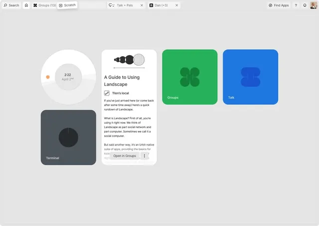
Desktop UI layout for a guide app featuring minimal icon cards, timeline widget, and documentation panel in a cool-toned grid.
Summary
Desktop UI for a guide or documentation app showing three main cards (Groups, Talk, Terminal) alongside a white documentation panel and a circular timeline widget, all on a light gray background.
Visual description
Four distinct UI components arranged on a light background. Left column: a large circular widget with two concentric rings and a small orange indicator (timestamp "2:22 April 2nd"), and below it a dark gray square card labeled "Terminal" with a circular icon. Center: a white card with the heading "A Guide to Using Landscape", featuring a grayscale circular progress indicator at the top, body text in a serif font, and an "Open in Groups" button at the bottom. Right two cards: "Groups" on a bright kelly green background with a four-circle icon in darker green; "Talk" on a rich blue background with a simplified people icon. All text is clean sans-serif. The layout uses strong color blocking and ample breathing room.
Key takeaway
The card-based grid organization with strategic color blocking to define distinct sections and features. The combination of a documented panel (center) flanked by action cards (sides) creates clear information hierarchy. The flat icon style and color palette choices (bright green and blue against neutral backgrounds) establish visual clarity without visual weight.
Reuse notes
Strong for onboarding flows, feature introductions, or documentation sidebars in collaboration or productivity apps. Works well when you need to show multiple modes or features at a glance. The symmetrical grid scales cleanly to tablet layouts.
More like this



Keep what you find
A free account saves references to boards and can send you a weekly email of picks based on what you save.
To see every result, go Pro.