Preview image. Unlock full-res
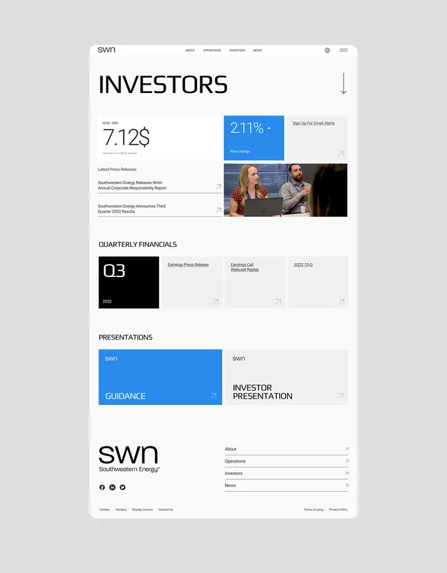
Corporate investor relations page for Southwestern Energy with a large KPI hero (7.12$), guidance CTA, latest press releases, quarterly earnings cards, and presentation links in a clean grid layout.
Summary
Corporate investor relations landing page using a bold typography hierarchy, bright blue CTA, KPI callout, stacked card grid for press releases and earnings, and footer presentation links to segment content for multiple audience types.
Visual description
A tall, single-column page layout on light gray background. The top navigation bar is minimal, showing the SWN logo and navigation items (About, Operations, Investors, News) plus hamburger menu. Below, "INVESTORS" as a large heading with a down-chevron. A large metric "7.12$" with small label and context text sits on the left, while a prominent bright blue (#2A8BED) rectangular button labeled "2.11% • Price Change" and "Sign Up For Email Alerts" is aligned to the right. The center section has "Latest Press Releases" with three linked items stacked vertically, each with an external-link icon. Below that, "QUARTERLY FINANCIALS" leads a grid of three cards: the first is a black box with white "Q3" and "2022" text, the second shows "Earnings Press Release" and "Earnings Call Webcast Replay" with page numbers, the third is blank. A "PRESENTATIONS" section below contains a large blue card labeled "SWN GUIDANCE" and a gray card with "SWN INVESTOR PRESENTATION" side by side. The footer shows the SWN logo, social icons, and footer menu (Careers, Vendors, Investor Relations, Contact Us) and legal links. Typography is clean, all-caps headers, sans-serif body, and high contrast on white.
Key takeaway
The large KPI presentation (7.12$) followed by a secondary metric in a contrasting blue CTA creates an information hierarchy that draws the eye to the key number first. The stacked card grid for press releases and earnings data chunks complexity without overwhelming. The use of black, blue, and white (no gradients, no decorative graphics) feels authoritative. All-caps section headers and generous spacing between sections aid scannability. External-link icons signal actionable items without needing button styling.
Reuse notes
Strong template for financial services, investor relations, or corporate sites where a primary metric dominates. The blue-and-black color scheme signals seriousness and is common in fintech and energy sectors. Works well when targeting multiple audiences (press, investors, employees) on one page via clear section breaks. The card grid pattern scales to more items without loss of clarity. Note the design avoids any imagery except the company logo and a small screenshot, keeping the focus purely on data and CTAs. Ensure the KPI label is brief and the guidance CTA text is clear and scannable.
More like this



Keep what you find
A free account saves references to boards and can send you a weekly email of picks based on what you save.
To see every result, go Pro.