Preview image. Unlock full-res
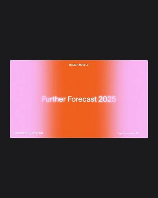
Vibrant pink-to-orange gradient background with centered title text, optimized for forecast or trend-report presentation.
Summary
A trend-report presentation card with a smooth diagonal gradient flowing from hot pink through coral to deep orange, framing centered white typography.
Visual description
A horizontal rectangle card with a dynamic gradient fill that transitions diagonally from soft pink in the top-left corner through warm orange in the center to deeper coral on the right. The gradient is smooth and well-blended without hard edges. Overlaid on this background are three aligned text elements in white sans-serif: a small sans-serif tag "DESIGN HOTELS" at top-left, a large bold headline "Further Forecast 2025" centered in the middle, and smaller text "Community Capital" and what appears to be a metadata label at bottom-left and bottom-right corners. The composition is strictly horizontal with generous internal padding and centered vertical alignment.
Key takeaway
The smooth diagonal color progression that reads as energetic without being jarring. The technique of using a multi-stop gradient to create visual interest while maintaining legibility. The color-blocking of text at top and bottom against the gradient without a background shape.
Reuse notes
Ideal for deck title slides, report covers, trend forecasts, and consulting presentations. Works best for contemporary B2B services. Can be adapted for different text content or color stops while maintaining the diagonal directional flow.
More like this


Keep what you find
A free account saves references to boards and can send you a weekly email of picks based on what you save.
To see every result, go Pro.