Preview image. Unlock full-res
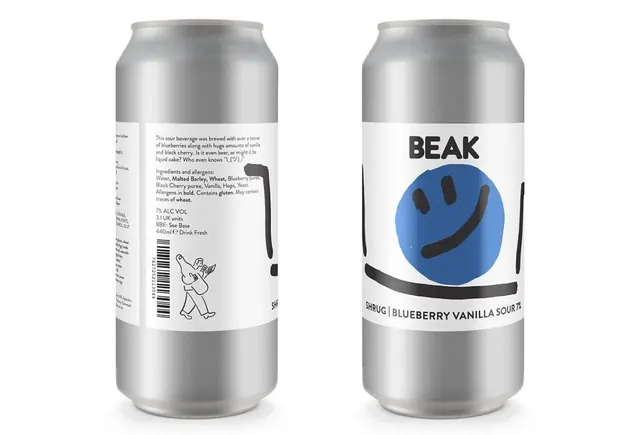
A packaged beverage mockup showing two metallic cans with contrasting design: minimal text-focused front, playful illustrated back.
Summary
A double-sided beverage can mockup illustrating a minimalist craft beer brand with metallic finish, bold typographic hierarchy, and playful accents.
Visual description
Two full-height metallic silver aluminum cans stand side by side against a clean white background. The left side shows the back label with justified body text in a small sans-serif, barcode with sketch illustration, and functional product info (ABV, volume, drink-fresh instruction) arranged in a tight, scannable grid. The right side displays the branded front face with the oversized, blocky brand name "BEAK" centered above a large flat emoji-style smiling face in a vibrant teal-blue circle, centered on a white label band. The metallic can cap and body create a premium, reflective quality against the neutral background.
Key takeaway
The two-sided label approach that balances minimal hierarchy (back: small, functional, dense) with bold brand presence (front: one massive identifier, one playful icon). The flat emoji icon paired with heavy sans-serif caps creates approachable personality without complexity. The tight vertical text arrangement on the back makes small space feel intentional rather than cramped.
Reuse notes
Strong reference for craft beverage, food, or specialty product packaging where brand recognition is key and front shelf-presence drives category sales. Works especially well for playful, indie brands aiming for premium minimalism rather than ornament. The two-label strategy suits products needing both ingredient density and visual impact.
More like this


Keep what you find
A free account saves references to boards and can send you a weekly email of picks based on what you save.
To see every result, go Pro.