Preview image. Unlock full-res
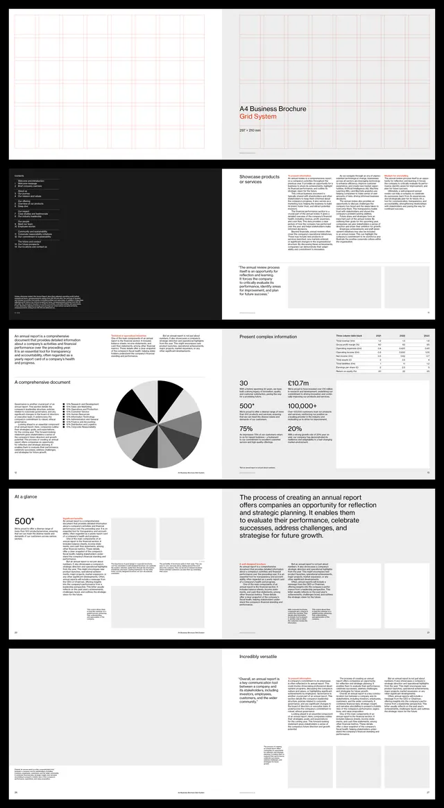
A grid-based annual report layout system using black, white, and neutral tones with modular sections for text, data visualizations, and financial charts.
Summary
A multi-page annual report layout system using structured grids, monochromatic color, and modular sections to present financial data, narrative copy, and charts with consistent hierarchy.
Visual description
The layout spans six pages, each divided into a strict grid with generous whitespace. Page 1 introduces the report title in red and black. Pages include dense body text set in sans-serif, left- and right-aligned in columns; a pie chart rendered in grayscale with labeled segments; a timeline-style data section; and financial summary boxes. All elements use the same neutral palette, with heavy reliance on horizontal rules and justified text blocks to create clear visual separation. Typography is consistent, with consistent line spacing and margin rules across pages.
Key takeaway
The modular grid approach that lets each section (narrative, chart, data table) breathe independently while maintaining visual unity. The strategic use of red as a single accent color to call out key figures against the neutral background. The restraint in not varying the typeface or adding decorative elements, letting structure itself be the design.
Reuse notes
Strong template for financial services, consulting, and corporate reports. Works best when you have real data and narrative to fill it. The structure is tight enough to enforce clarity; adapt the palette if your brand needs more color, but keep the grid discipline.
More like this





Keep what you find
A free account saves references to boards and can send you a weekly email of picks based on what you save.
To see every result, go Pro.