Preview image. Unlock full-res
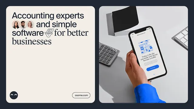
Split-panel fintech marketing composition: left panel presents brand messaging with avatar faces and a checkmark symbol on cream background; right panel shows a product mockup of a financial app on a phone held in hand against a neutral desk environment.
Summary
Two-panel marketing layout for a fintech accounting platform pairing brand messaging (with team avatars) against a product-in-context mockup showing the app interface on a mobile device.
Visual description
Left panel: cream-colored rounded rectangle containing dark sans-serif headline "Accounting experts and simple software for better businesses" with three small circular avatar faces (representing team members) and a small checkmark or software icon inline with the text. Subtle smiley emoji in the bottom-left corner. "osome.com" URL appears in a minimalist outlined pill button at the bottom-right.
Right panel: gray-toned product mockup showing a human hand (wearing a bright blue sleeve) holding a phone displaying an accounting app interface with blue accents, blue CTA button, and a simplified illustration dashboard. Surrounding elements include a calculator (top-left), a black folder or document (top), and a keyboard (bottom-left), all rendered in soft grays suggesting a workspace environment.
Both panels sit on a dark charcoal background. Rounded corners on the panels and soft shadows create depth. All typography is clean, dark sans-serif.
Key takeaway
The two-panel split separates the abstract promise (expert team + simple software) from the concrete proof (product interface in a real hand). The casual emoji and rounded shapes soften the corporate category. Using neutral product photography context (desk, keyboard, calculator) makes the app feel integrated into a real workflow rather than isolated.
Reuse notes
Strong template for B2B fintech and accounting software. The left panel can be adapted for any trust-based service; the right panel approach works when you have a good product screenshot. The emoji humanizes an otherwise buttoned-up category. Color accent should match the app's primary CTA color to reinforce brand recognition.
More like this


Keep what you find
A free account saves references to boards and can send you a weekly email of picks based on what you save.
To see every result, go Pro.