Preview image. Unlock full-res
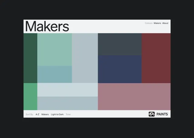
Paint brand color palette interface with organized grid display, clean typography, and sort/filter controls.
Summary
Paint brand color palette interface with a multi-column grid of color swatches, header navigation, and sort/filter controls.
Visual description
A dark-themed interface displaying a color palette browsing tool. The header is light with the word "Makers" in large sans-serif type, with tabs for "Colours" (active), "Makers", and "About" aligned right. Below is a grid of color swatches arranged in roughly 5 columns and 4 rows, showing deep teals, soft aqua, grays, slate blues, and muted burgundy tones. The color swatches are uneven in width and height, creating an organic asymmetric composition. Below the grid is a footer with sort controls (sort by A-Z, Makers, Light to Dark, Tone) and a "Paints" logo. The overall color palette spans muted warm (taupe, burgundy) and cool tones (teal, slate, gray). The design emphasizes clarity and functionality with ample whitespace and a flat, modern aesthetic.
Key takeaway
The asymmetric grid layout of color swatches creates visual rhythm while remaining organized. The sort/filter controls at the bottom are minimal and unobtrusive. The two-tone header (light content area with dark background) creates strong contrast and directs attention. The restrained muted palette is more sophisticated than bright alternatives while remaining visually distinct.
Reuse notes
Ideal for paint, fabric, or materials product browsing interfaces. The grid approach scales well whether you have 15 or 150 colors. The muted palette is professional enough for B2B or ecommerce contexts. Keep sort options lightweight if designing for mobile. Works best when the actual color swatches are the stars; avoid adding pattern or texture to the surrounding UI.
More like this




Keep what you find
A free account saves references to boards and can send you a weekly email of picks based on what you save.
To see every result, go Pro.