Preview image. Unlock full-res
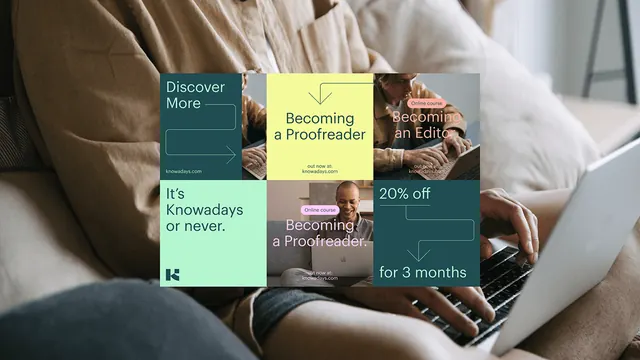
Staggered rectangular promotional cards in muted sage, teal, and neutral tones layered on a soft textured background, creating depth through offset positioning and a warm, inviting color palette.
Summary
Staggered rectangular promotional cards in muted sage, teal, and neutral tones layered on a soft textured background, creating depth through offset positioning and a warm, inviting color palette.
Visual description
A composition of overlapping rectangular cards in muted earth tones (teal-green, soft sage, warm beige, dark charcoal) positioned at staggered angles on a soft, linen-like off-white background. Cards contain brief copy and offers (visible text includes promotional language). The offset, floating arrangement creates a casual yet organized feeling. Typography is clean sans-serif in dark text on light cards. Subtle shadows suggest depth.
Key takeaway
The offset stagger breaks the grid monotony while maintaining visual order. The muted, earthy color palette feels premium and calm despite using cool and warm colors together. The soft background texture prevents digital flatness. This layout works for multi-product promotions or service offerings without feeling cluttered.
Reuse notes
Works well for educational platforms, SaaS, or B2B service pages. The warm, inviting palette is approachable without being casual. The offset positioning suits product or feature comparison layouts. Ensure cards remain legible at small screens; the overlapping may need adjustment for mobile. Avoid using on dark backgrounds; this design relies on contrast.
More like this






Keep what you find
A free account saves references to boards and can send you a weekly email of picks based on what you save.
To see every result, go Pro.