Preview image. Unlock full-res
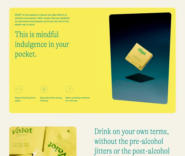
Product landing page for RESET with bright yellow and teal split layout, benefit icons, and floating product shot.
Summary
Product page for RESET (alcohol modulation drink) using a bold yellow-and-teal split layout with three benefit icons on the left and a floating product shot on the right.
Visual description
Left half is a bright neon yellow field with teal serif headline reading "This is mindful indulgence in your pocket." Below it are three teal-outlined circular benefit icons (reduce flushing, ease discomfort during drinking, wake up refreshed) with minimal line illustrations and descriptive text. Right half shows a dark teal-to-black gradient background with a 3D product shot of the yellow RESET packet centered and slightly elevated, creating depth. Bottom edge shows a partial yellow product label. Layout balances solid color fields with typography and icon density on one side against spacious photography on the other.
Key takeaway
The split asymmetry between text-and-icons density and open product photography; the benefit icons using outline circles and minimal illustration to avoid visual clutter; the teal-yellow pairing for wellness credibility and energy.
Reuse notes
Strong for beverage or wellness landing pages. The benefit-icon row works well above the fold to anchor product claims. Best when the product itself is visually strong enough to carry the right half.
More like this




Keep what you find
A free account saves references to boards and can send you a weekly email of picks based on what you save.
To see every result, go Pro.