Preview image. Unlock full-res
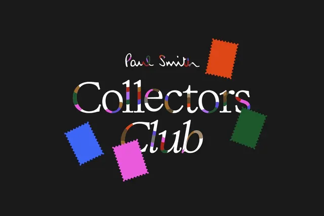
Luxury membership identity pairing a handwritten signature with bold serif-sans display type, each letter independently colored, accented by floating geometric shapes.
Summary
Luxury membership identity pairing a handwritten signature with bold serif-sans display type, each letter independently colored, accented by floating geometric shapes.
Visual description
Dark background with cream handwritten "Paul Smith" signature at upper center. Large bold serif-sans "Collectors Club" headline below, with each letter filled in vibrant hues (electric blue, hot pink, magenta, tan, coral). Four offset rectangular shapes in bright neon colors (orange, blue, magenta, forest green) with slightly roughened edges scatter around the typography, creating dynamic movement and playful asymmetry.
Key takeaway
The technique of coloring individual letterforms in a headline differently while maintaining readability. The discipline of using just a few bright accent colors against a dark neutral. How floating geometric shapes balance a centered typographic composition without feeling random.
Reuse notes
Strong for exclusive or membership-oriented brands wanting sophistication plus personality. Works especially well for premium retail, luxury goods, or members-only services. The multicolor letters work only on display-size type; avoid for body text.
More like this



Keep what you find
A free account saves references to boards and can send you a weekly email of picks based on what you save.
To see every result, go Pro.