Preview image. Unlock full-res
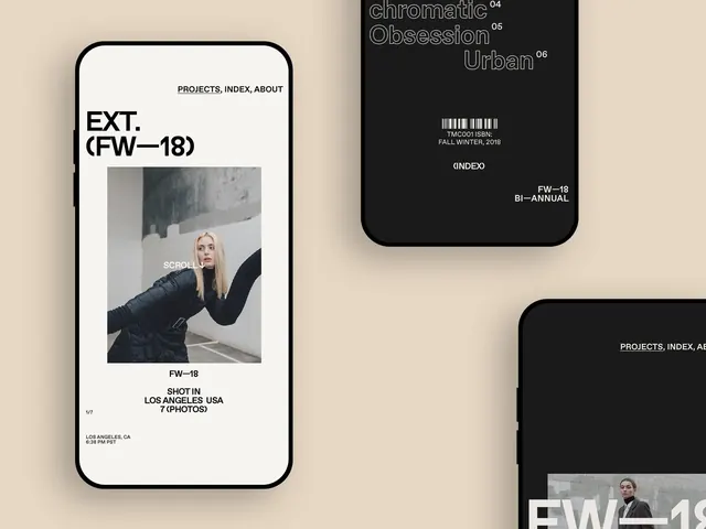
Side-by-side mobile mockups comparing minimalist portfolio branding (light) with dark magazine cover design.
Summary
Split-screen portfolio and magazine mockup showing contrasting light and dark editorial designs on mobile phones.
Visual description
Two rounded-corner mobile phones positioned side by side against a warm beige background. Left phone has a light beige screen with black sans-serif type including the masthead "EXT. (FW-18)" and navigation menu ("PROJECTS, INDEX, ABOUT"). Below sits a grayscale photograph of a person in dark clothing with "SCROLL" overlay text, followed by metadata ("FW-18", "SHOT IN LOS ANGELES USA 7 (PHOTOS)"). Right phone displays a black screen with outlined serif typography reading "chromatic Obsession Urban" in white lines, numbered chapter markers (04, 05, 06), ISBN barcode, publication info ("FALL WINTER, 2018"), and index notation. The design emphasizes typographic contrast and clean, structured layouts.
Key takeaway
The side-by-side comparison of inverse color schemes demonstrates editorial restraint; using monochrome photography and outlined type on dark keeps visual weight minimal while maintaining visual interest through compositional hierarchy and publication metadata. The nav and info layout patterns are reproducible for any editorial or portfolio branding.
Reuse notes
Strong reference for editorial design systems, publication branding, and portfolio presentation mockups. Works well for designer portfolios, independent magazines, or institutional publication layouts. The black-and-light contrast pairing is particularly effective for modern editorial brands targeting creative industries.
More like this

Keep what you find
A free account saves references to boards and can send you a weekly email of picks based on what you save.
To see every result, go Pro.