Preview image. Unlock full-res
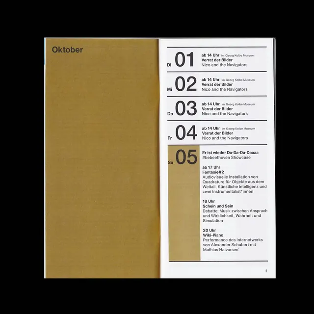
A two-page calendar layout pairing a kraft-brown left edge with a numbered event list on white, using typography hierarchy and warm neutrals to organize October programming.
Summary
A two-page calendar layout pairing a kraft-brown left edge with a numbered event list on white, using typography hierarchy and warm neutrals to organize October programming.
Visual description
Left page: kraft-brown solid with "October" label in sans-serif. Right page: white background with vertically numbered events (.01 through .05 visible, suggesting a longer list). Each entry has a bold numeral in larger kraft-brown type, followed by body text in black. Wide margins and clean alignment create breathing room. The brown-to-white transition feels like a bound publication edge, reinforcing the editorial treatment.
Key takeaway
The color-blocking pairing (kraft edge anchors the spread without overwhelming). The numbered hierarchy (bold numerals create scannable entry points for an event list). The two-column asymmetry (color on one side, information on the other) is a simple but effective layout pattern for calendars or guides.
Reuse notes
Strong template for cultural institution guides, event calendars, or academic publishing. Works well when you have a fixed set of discrete items to list. Kraft or colored edges pair best with long-form body copy, not short snippets.
More like this






Keep what you find
A free account saves references to boards and can send you a weekly email of picks based on what you save.
To see every result, go Pro.