Preview image. Unlock full-res
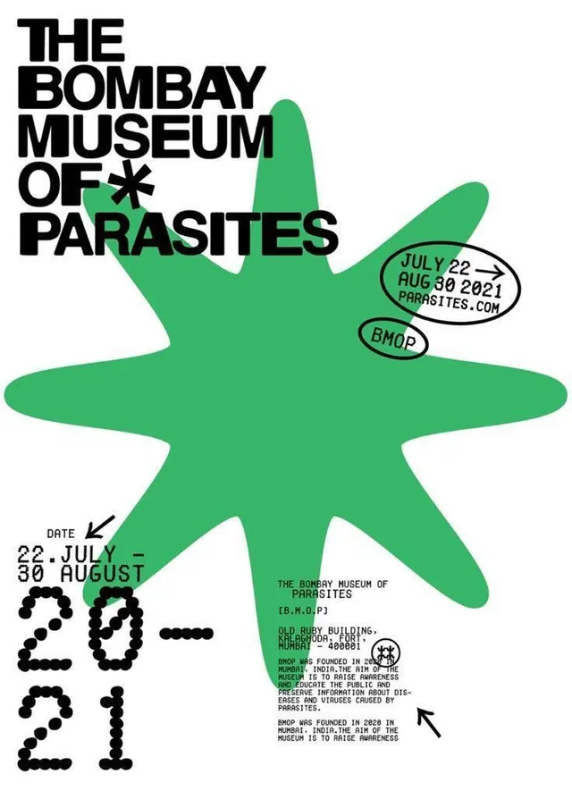
Contemporary exhibition poster for 'The Bombay Museum of Parasites' using a large kelly-green starfish silhouette as visual metaphor, paired with bold sans-serif title and dot-composed dates.
Summary
A contemporary exhibition poster that uses a bold, kelly-green starfish as the primary visual element to represent a parasitology museum, balancing playful organic form with strict Swiss typography and institutional information.
Visual description
Asymmetrical composition with a dominant centered starfish figure dominating the vertical center and right edge. The starfish is rendered as a flat, organic silhouette in kelly green with five rounded arms. Upper left: the title "THE BOMBAY MUSEUM OF" in black all-caps sans-serif (Helvetica-weight), followed by an asterisk and "PARASITES" in the same bold weight, creating a justified text block. Small circular callouts in green ovals label "JULY 22 - AUG 30 2021" and "PARASITES.COM" and "BMOP" floated near the starfish arms. Lower left: event dates rendered in dot-matrix style typography ("22.JUL - 30.AUG" and "2021") in black bullets. Lower right: institutional footer text in small justified sans-serif. Palette: white background, kelly green, black, grey accents.
Key takeaway
Organic shape as primary visual anchor paired with strict, geometric typography creates playful-meets-professional tension. Dot-matrix date treatment is distinctive and readable at distance. Using a single accent color (green) across the starfish and callout bubbles unifies disparate information without requiring design elements like boxes or lines. The asymmetric distribution of text (left and lower) balances the starfish weight (center-right).
Reuse notes
Strong for cultural and educational institutions (museums, galleries, nonprofits) where playfulness signals accessibility without sacrificing authority. The starfish metaphor works because its organic form contrasts sharply with the rigid sans-serif and institutional layout; adapt the organic shape to match your subject. Requires high contrast and bold color to work at poster scale. The dot-matrix date treatment reads better for printed/large formats; at web scale, consider switching to outline or line-weight display figures.
More like this





Keep what you find
A free account saves references to boards and can send you a weekly email of picks based on what you save.
To see every result, go Pro.