Preview image. Unlock full-res
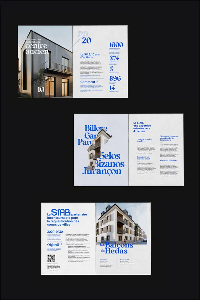
Academic publication layout with architectural photography, blue accent typography, and grid-based information hierarchy across three folded panels.
Summary
Academic publication layout with architectural photography, blue accent typography, and grid-based information hierarchy across three folded panels.
Visual description
Three modular brochure panels stacked vertically against a dark background. Each panel combines a full-height architectural photograph on the left with a right-aligned text block. The typography hierarchy uses a bold blue headline (Portuguese text), followed by structured body copy in small sans-serif, with a QR code. The panels vary in their accent color: the top uses a cool blue, the middle introduces a darker blue accent, and the bottom repeats blue. All panels align to a strict grid, using the photograph and white/gray negative space to define the composition. The overall effect is academic and research-focused, emphasizing the building images and structured information layout.
Key takeaway
The pairing of full-bleed photography with a narrow justified text column; using color-only (blue headline on white) to create hierarchy without boxes; the modular three-panel structure that stacks but reads as independent units.
Reuse notes
Works well for architectural portfolios, academic publications, and urban-planning briefs where photography and structured metadata coexist. Best suited to dark backgrounds for the mockup; white-background versions would shift the hierarchy. The tri-fold format works for both print brochures and digital presentations.
More like this



Keep what you find
A free account saves references to boards and can send you a weekly email of picks based on what you save.
To see every result, go Pro.