Preview image. Unlock full-res
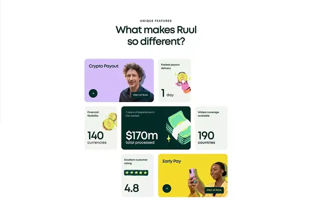
A modular bento-grid layout showcasing fintech product features via colored cards, large statistics, and branded product photography, arranged asymmetrically with mixed accent colors.
Summary
A modular bento-grid layout showcasing fintech product features via colored cards, large statistics, and branded product photography, arranged asymmetrically with mixed accent colors.
Visual description
Centered headline "What makes Ruul so different?" with a "Unique Features" label above. Below, an asymmetric grid of cards: a lavender-purple card with a man's portrait and "Crypto Payout" copy (top left); a pale-gray card with a stacked-coins icon and "Fastest payout delivery 1 day" (top right); three bottom cards for "Financial flexibility 140 currencies", a dark teal card with "$170m total processed" and a money-stack icon, and "Widest coverage available 190 countries"; a final large card in bright yellow with "Early Pay" headline and a woman holding a colorful phone mockup. Each card has either product photography or illustrated icons. All type is sans-serif in black or dark-gray. White background throughout.
Key takeaway
Bento grids work for packaging varied feature types and stat densities together. Asymmetric arrangement and mixed card colors (pastels + bright accent) create personality without losing professionalism. Pairing photography with statistics and iconography balances emotional appeal and credibility. The 1:1 or 1.33:1 card ratios are easier to scan than uniform grids.
Reuse notes
Use this for fintech, crypto, or payment product marketing to show multiple differentiators at once. Works when features vary in importance or type (testimonial, metric, capability). Avoid if you need a strictly symmetric, formal feel.
More like this


Keep what you find
A free account saves references to boards and can send you a weekly email of picks based on what you save.
To see every result, go Pro.