Preview image. Unlock full-res
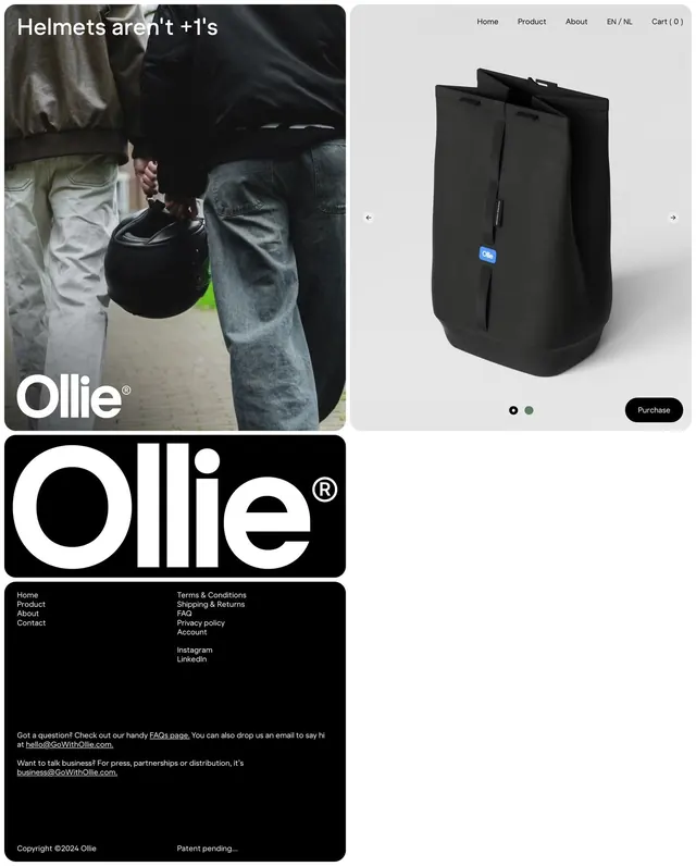
E-commerce product page for a bicycle helmet brand featuring split layout with lifestyle photography on left and minimal product showcase on right.
Summary
Split-screen product page for a bicycle helmet brand balancing moody lifestyle photography with a clean, minimalist product view on a white background.
Visual description
Left side: action photograph of people wearing dark clothing and holding a black helmet bag against their legs, shot outdoors with natural lighting and muted tones, anchored by the Ollie logo and tagline "Helmets aren't +1's". Right side: minimal product view on white background showing the black helmet bag from a three-quarter angle with carousel navigation and color variant dots, a small blue label visible on the bag, and a black "Purchase" button. Top navigation menu in sans-serif shows Home, Product, About, language toggle, and shopping cart. Bottom section: large bold "Ollie" wordmark in white on black background with footer links and contact information (address in Paris, France, email, social links, copyright).
Key takeaway
The split-layout pairing of lifestyle photography with a product shot isolates each storytelling mode and makes the page scannable: emotion and context on the left, specification and purchase on the right. The consistent monochromatic + high-key approach unifies disparate sections. The small blue product label echoes accent color without dominating the neutral palette.
Reuse notes
Strong template for selling functional gear or safety products where the user benefits as much as the lifestyle context. Works because the lifestyle side grounds the product in real use; works less well when the product itself is the visual hero. Footer stays compact and professional.
More like this
Keep what you find
A free account saves references to boards and can send you a weekly email of picks based on what you save.
To see every result, go Pro.