Preview image. Unlock full-res
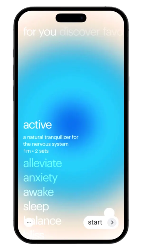
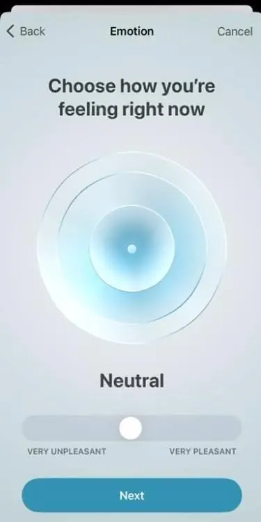
A mobile app emotion-selection interface using concentric gradient circles and a horizontal slider to represent a spectrum from unpleasant to pleasant.
Summary
A mobile app emotion-selection interface using concentric gradient circles and a horizontal slider to represent a spectrum from unpleasant to pleasant.
Visual description
Pale blue-gray screen with dark-text header "Emotion" and "Back" / "Cancel" buttons. Centered below: a large radial gradient of three soft concentric circles in pale blue/cyan, fading to white at the edges, with a small white dot at the core. Below the circles, text reads "Neutral" in dark gray. A horizontal slider sits below with a white draggable knob, labeled "Very Unpleasant" (left) and "Very Pleasant" (right). A teal rounded button labeled "Next" spans the bottom. All elements are symmetrically centered; generous white space surrounds the interactive elements.
Key takeaway
Concentric gradients create a calm focal point and make sentiment feel continuous rather than binary. A horizontal slider paired with a visual metaphor (the gradient circle) makes the scale intuitive. Pale, monochromatic color blocking and soft transitions signal safety and comfort, ideal for mental-health or wellness apps.
Reuse notes
Reach for this when designing emotion tracking, mood logging, or wellness survey screens. The radial gradient technique works for any scalar input (1-10 pain, energy, focus). Avoid if you need a snappier, bolder visual style; this is inherently serene.