Preview image. Unlock full-res
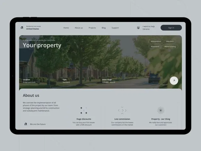
Laptop mockup of a property-listing website with hero image, property details, and about-us section with three feature cards.
Summary
A laptop mockup displaying a minimal property-listing website with a hero section, property metadata overlay, and feature cards below the fold.
Visual description
Gray laptop frame containing a real-estate website interface. Top navigation bar with left-aligned location text and site logo, right-aligned navigation menu (Home, About us, Projects, Blog, Support) and Sign in button. Large hero image of a residential tree-lined street filling the top half of the viewport with overlaid property details (Location, Type, Price range, tags: renovation, stone-built, plan, green-building) in dark text boxes. Below: white section with "About us" heading, body copy explaining the company's project implementation and service phases, followed by three minimal feature cards: one highlighting "Huge discounts" with small icon, one for "Low commission," one for "Property, our thing," each with minimal small geometric icons in muted tones and a subtle green accent (complementary to the hero foliage).
Key takeaway
The restrained use of a single green accent color picking from the hero image and used as focal point in the feature cards; the property-overlay pattern for showing metadata without blocking the hero image; the minimal three-card feature layout with small icons that avoids visual clutter.
Reuse notes
Works well for real-estate, property-listing, and ecommerce sites that prioritize photography and metadata. The green accent would be site-specific; swap to match the brand or a key visual from the hero. The minimal card approach scales down well for mobile and avoids card fatigue.
More like this

Keep what you find
A free account saves references to boards and can send you a weekly email of picks based on what you save.
To see every result, go Pro.