Preview image. Unlock full-res
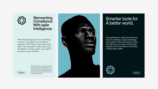
Minimal three-column layout pairing a light-blue left section, a teal portrait frame in the center, and a dark navy right section with coherent messaging about technology and compliance.
Summary
A three-column layout with distinct color zones featuring a geometric spiral icon and headline on light blue (left), a high-contrast portrait silhouette on teal (center), and a call-to-action with messaging on dark navy (right).
Visual description
Three equal columns at horizontal parity. Left column (light blue background): geometric circular spiral icon above a headline "Reinventing Compliance With agile Intelligence" in black sans-serif, followed by body copy explaining seamless process and agile workflow. Center column (teal background): full-height portrait silhouette of a person's face in black against the teal, creating stark figure-ground contrast with negative space around the head. Right column (dark navy background): reversed-out white headline "Smarter tools for A better world" with body copy about human-centered technology, small spiral icon at bottom (light blue), and "Explore" outline button. Sans-serif throughout; consistent typography weight and size across all three zones. Generous padding, centered text alignment, strong color separation between columns.
Key takeaway
The three-column split using color zones and visual weight distribution (icon plus type, silhouette, type plus icon again) creates movement and rhythm without animation. The centered portrait acts as a human anchor in the middle, balanced by twin iconography and messaging on either side. The reversed-out white type on navy pulls focus while the light-blue left column invites entry.
Reuse notes
Excellent for B2B technology or consulting landing pages where you need to establish trustworthiness, showcase a person or story, and close with an action. Works well when the portrait is strong and asymmetric (a profile, a tilt, or directional gaze). The three-column format demands sufficient viewport width and may stack less gracefully on narrow screens, so test responsive breakpoints early.
More like this


Keep what you find
A free account saves references to boards and can send you a weekly email of picks based on what you save.
To see every result, go Pro.