Preview image. Unlock full-res
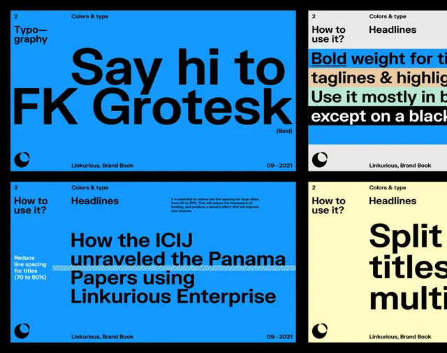
Brand book typography specimens showing FK Grotesk typeface on electric blue and pale yellow backgrounds with layout and color guidance.
Summary
Four pages from the Linkurious brand guideline showing FK Grotesk typeface specimens with usage rules on electric blue and pale yellow grounds.
Visual description
A four-panel brand book layout. Upper left: bright electric blue background with large black FK Grotesk headlines ("Say hi to FK Grotesk") and label "Typography" and "How to use it?" with guidance about bold weight for titles and taglines. Upper right: pale yellow background with black text showing headline treatments, color guidance, and usage restrictions on dark. Lower left: blue panel repeating the "How to use it?" format with detailed guidelines on reducing line spacing for large titles, with a blue striped accent line and specimen text "How the ICIJ unraveled the Panama Papers using Linkurious Enterprise." Lower right: soft yellow panel showing "Split titles multiple" treatments. All panels carry the Linkurious logo and "09-2021" date. Typography is clean sans-serif in strong blacks against contrasting backgrounds.
Key takeaway
The split two-color background strategy for visual contrast and page organization in dense guideline documents; the precise usage rules stated inline (e.g. "70 to 80%") rather than as separate callouts; the alternating blue-yellow rhythm breaking up guideline monotony.
Reuse notes
Useful reference for building enterprise brand guidebooks where typeface and color are the primary design system assets. The layout works well for b2b and technology brands. Works best when your brand palette has strong complementary colors.
More like this



Keep what you find
A free account saves references to boards and can send you a weekly email of picks based on what you save.
To see every result, go Pro.