Preview image. Unlock full-res
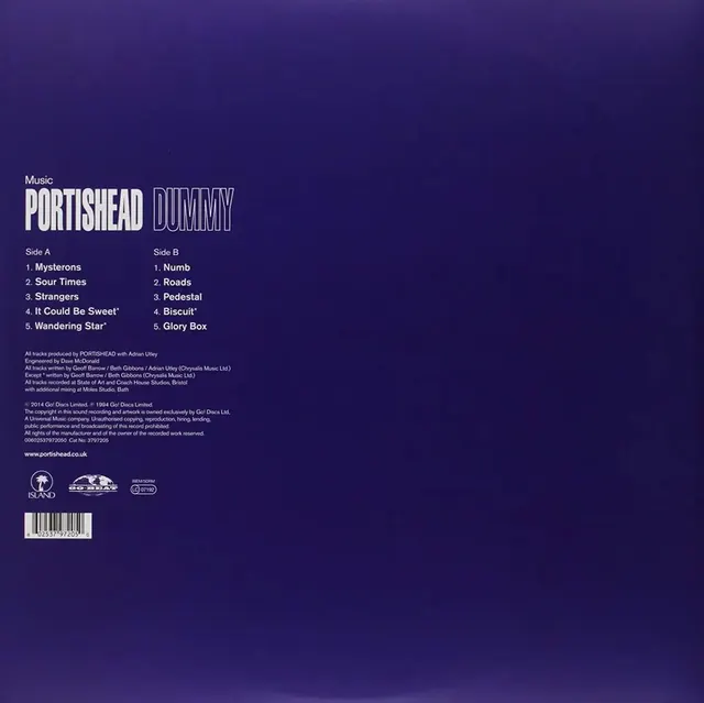
Album back cover for Portishead's Dummy vinyl with bold display type, two-column track listing, and deep purple gradient background.
Summary
The back cover of Portishead's 1994 Dummy album, featuring outlined display type, two-column track listings for Sides A and B, and extensive production credits on a solid deep purple background.
Visual description
Deep purple monochromatic background filling the entire space. Top section: "Music" label in small caps, followed by "PORTISHEAD DUMMY" in large outlined sans-serif display type (letters appear hollow/stroked). Two track-list columns below, with "Side A" (tracks 1-5: Mysteries, Sour Times, Strangers, etc.) and "Side B" (tracks 1-5: Numb, Roads, Pedestal, etc.) in white sans-serif body text. Mid-section: dense block of production credits and copyright information in 8-point serif type running 10+ lines. Lower section: three institutional logos (Island Records, NOSHEAR, PROFFFORM) in white outline format, followed by a barcode in light gray. Website URL at very bottom (www.portishead.co.uk). Information flows vertically from top to bottom with consistent left alignment and compact line spacing.
Key takeaway
The striking outlined display type (hollow letterforms) that commands attention despite being the sole visual element. The strict information hierarchy: display headline, track listings, metadata, legal/production info, logos, barcode, stacked in clear order. The sophisticated, minimal color choice (single deep purple + white type) that feels expensive and intentional rather than constrained. The efficient use of typography alone for visual interest, with no imagery or patterns needed.
Reuse notes
Strong model for music packaging, vinyl releases, or any print collateral where brand sophistication is conveyed through type restraint. Works especially well in institutional contexts (labels, studios, publishers) where credibility matters. The outlined type treatment scales down poorly below 48pt; keep headlines large. Requires legible font weights; very thin outlines risk disappearing. The information density works for album packaging but would overwhelm promotional graphics or advertising.
More like this


Keep what you find
A free account saves references to boards and can send you a weekly email of picks based on what you save.
To see every result, go Pro.