Preview image. Unlock full-res
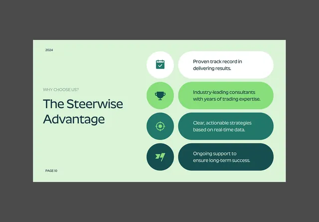
A presentation slide for Steerwise consulting featuring a dark charcoal background with a mint-green content panel listing four key value propositions as paired icon-and-text callouts.
Summary
A presentation slide from Steerwise consulting with a left-aligned headline on a mint-green background panel, paired with four icon-labeled callouts stacked vertically on the right, describing market advantages and service promises against a dark gray field.
Visual description
The slide uses a landscape orientation divided into two zones: a tall mint-green panel on the left contains "WHY CHOOSE US?" in smaller type and "The Steerwise Advantage" as the dominant headline in bold sans-serif, with "PAGE 10" footer anchoring the design. The right side features four stacked rounded-rectangle callouts in progressively darker teals and greens, each prefaced by a simple icon (briefcase, trophy, target, growth arrow) and containing a single line of white text describing a benefit: "Proven track record in delivering results," "Industry-leading consultants with years of trading expertise," "Clear, actionable strategies based on real-time data," "Ongoing support to ensure long-term success." The background is dark charcoal gray, creating strong contrast against both the mint panel and the callout text.
Key takeaway
The asymmetric layout (text content left, callouts right) creates visual hierarchy without requiring a grid structure. Color progression in the callouts (light to dark green) guides the eye downward while keeping all four equally readable. Icon-plus-text pairs are more memorable than text alone, and the spacing within each callout creates breathing room around dense claims.
Reuse notes
Effective for B2B consulting, financial services, and strategy firms presenting differentiators in pitch decks or investor presentations. The dark-background treatment works well on large screens or printed materials where glossy finishes enhance the contrast. The icon glyphs and color progression could be adapted for different value propositions; ensure text remains legible in the darker callout tones.
More like this





Keep what you find
A free account saves references to boards and can send you a weekly email of picks based on what you save.
To see every result, go Pro.