Preview image. Unlock full-res
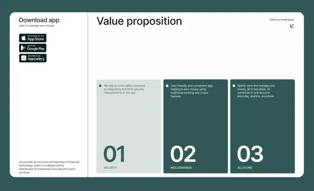
A three-column value-proposition layout on deep teal background with a left sidebar showing app store badges and a main section highlighting three benefit cards numbered 01-03.
Summary
A three-column value-proposition layout on deep teal background with a left sidebar showing app store badges and a main section highlighting three benefit cards numbered 01-03.
Visual description
Deep teal background split into two main sections. Left sidebar contains 'Download app' heading followed by vertically stacked dark app-store badge logos (Apple, Google, AppGallery style). Right section spans two-thirds and features 'Value proposition' headline with tagline 'banking made easy.' Below is a grid of three tall rectangular cards in increasing teal saturation (lightest left, darkest right). Each card displays a large white number (01, 02, 03), a centered topic label in capitals (SECURITY, INCLUSIVENESS, ALL IN ONE), and benefit copy in white sans-serif. Cards use subtle gradient fills from light gray-blue to deeper teal. Small descriptive copy sits in the far-left gutter on the deep teal background.
Key takeaway
Numbered cards create sequential storytelling without requiring visual differentiation. The gradient from light to dark across three cards implies progression or elevation. Left-aligned app badges use familiar brand recognition to build trust. Small supporting copy in the gutter maintains visual hierarchy while providing context.
Reuse notes
Ideal for fintech, banking, or security-focused products showing core benefits. The deep teal conveys trust and stability; the numbered progression works for any ordered feature set. Works well when each card's benefit can fit in two to three lines of copy. Avoid when features are equally important (numbering implies hierarchy).
More like this

Keep what you find
A free account saves references to boards and can send you a weekly email of picks based on what you save.
To see every result, go Pro.