Preview image. Unlock full-res
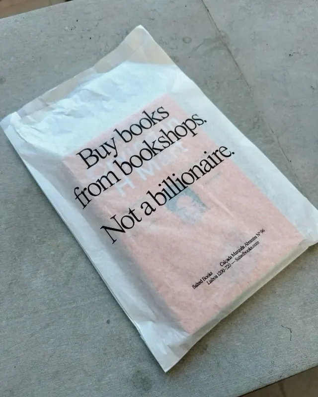
Minimalist activist tote bag with bold sans-serif headline, soft pastel color gradients, and anti-corporate messaging supporting independent bookstores.
Summary
A clear polyethylene tote with bold black sans-serif headline, soft gradient color-blocking (soft pink, pale blue), and small footer text promoting independent bookstore advocacy.
Visual description
A translucent white/clear plastic tote bag photographed flat on concrete. Bold, chunky sans-serif type in black reads "Buy books from bookshops. Not a billionaire." across the center in three lines, filling the width of the bag. Below the text, a soft watercolor-like gradient transitions from pale pink through soft periwinkle blue, creating color blocking without sharp edges. Small footer text in black at the bottom credits "Sarah Hodge + Claire Coulter Advisors; Estb. 1922; London, England" in a minimal, lowercase typeface. The overall effect is earnest, contemporary, and typographically restrained, letting the message speak directly.
Key takeaway
The restraint of using one bold typographic statement with minimal supporting elements; the soft gradient color-blocking technique that feels organic rather than corporate; the clear translation of activist messaging into product design without heavy-handed visuals or illustrations.
Reuse notes
Strong reference for activist or cause-driven graphic design, sustainable fashion, and grassroots retail advocacy. The typographic-only approach scales well to any merchandise format (stickers, prints, posters). Best when the message itself is the visual hero. The soft gradient works well on translucent or white materials; pair with high-contrast black type. Avoid on dark backgrounds or busy patterns.
More like this


Keep what you find
A free account saves references to boards and can send you a weekly email of picks based on what you save.
To see every result, go Pro.