Preview image. Unlock full-res
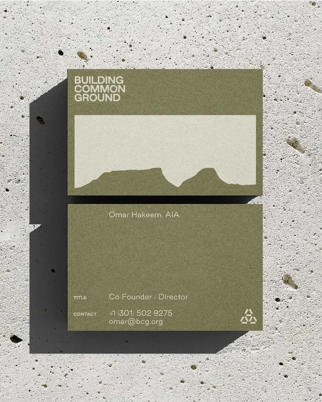
Minimal identity card for a nonprofit with stacked olive-green blocks, sans-serif typography, and an abstracted landscape cutout in negative space.
Summary
Nonprofit identity card using three stacked olive-green and cream bands, with organization name in caps, an abstracted landscape shape in negative space, and contact details in a smaller sans-serif.
Visual description
A rectangular card photographed on a speckled concrete surface. The design divides into three horizontal sections: a full-width olive-green band at top with white sans-serif caps "BUILDING COMMON GROUND", a cream center panel with an abstracted landscape silhouette (two rounded hill shapes) cut from its ground, and a bottom olive-green band with smaller text listing title, contact label, phone number, and email. A drop shadow on the right edge of the cream panel adds subtle dimension. The typography is set in a clean, geometric sans-serif. The palette is limited to four tones: dark gray, two shades of olive-green, and cream.
Key takeaway
The use of abstracted landscape shapes as a visual metaphor (relating to the name "Common Ground"). The three-band stacked structure creates rhythm and hierarchy. The card avoids decoration, letting the shape and color relationships do the work. The typography scale jump between headline caps and small contact info creates clear information hierarchy.
Reuse notes
A model for minimal nonprofit or civic organization branding. The earth-tone palette and landscape reference suit organizations focused on land, environment, community, or shared purpose. The horizontal stacked structure is highly adaptable to business cards, letterheads, or applications. Use when seeking understated, tactile-feeling identity systems.
More like this



Keep what you find
A free account saves references to boards and can send you a weekly email of picks based on what you save.
To see every result, go Pro.