Preview image. Unlock full-res
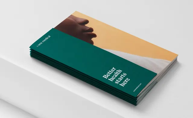
Stack of teal brochures with warm beige cover image and minimal sans-serif typography conveying trust and wellness.
Summary
Angled stack of teal brochures with a warm beige cover image of hands, pairing professional color-blocking with minimal sans-serif type on the spine.
Visual description
An isometric view of multiple teal brochures stacked at an angle on a neutral light-gray surface. The cover features a warm beige background with a photograph of a dark-skinned hand resting on the upper surface, creating an intimate human moment. The spine displays white sans-serif text in two lines, "Better health starts here," with a small logotype below. The interior pages show soft gray paper, visible in the slight stack separation. Warm sunlight creates a subtle shadow on the neutral backdrop.
Key takeaway
The pairing of a bold, saturated teal with warm beige as equal visual weights, avoiding a split-personality feel through clean white space and a single focal point. The hands-as-cover-element humanizes a corporate healthcare narrative without becoming cliched or overly styled.
Reuse notes
Strong for healthcare, wellness, or trust-forward B2B work. The angled mockup perspective works well in case studies or portfolio work; the color palette transfers to medical services, insurance, or patient-care contexts. Keep the color ratio 60/40 teal to beige to maintain visual anchoring.
More like this