Preview image. Unlock full-res
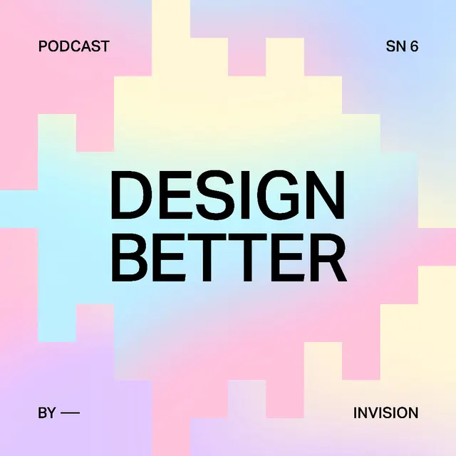
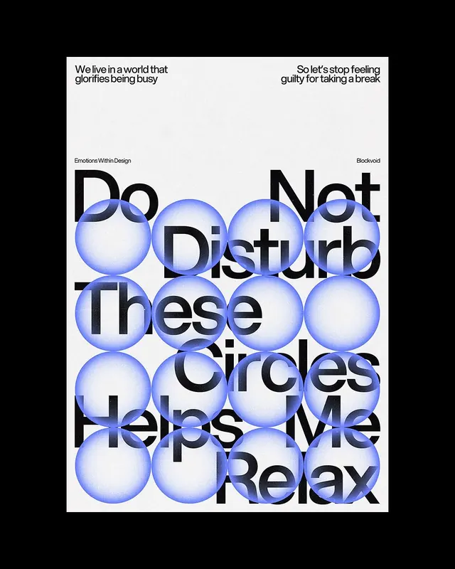
Podcast cover with soft pastel gradient blocks in pink, yellow, cyan, and purple framing centered bold sans-serif type.
Summary
Podcast cover featuring soft pastel geometric blocks in pink, yellow, cyan, and lavender arranged around centered bold black sans-serif headline type.
Visual description
Square composition with soft pastel gradient blocks arranged irregularly like stacked cards or architectural forms, creating depth without 3D rendering. Block colors: soft yellow, pale pink, light cyan, lavender, and white. Centered vertically are three lines of text: small "PODCAST" (top left), large bold sans-serif "DESIGN BETTER" in black, small "BY —" and "REVISION" (bottom right). The blocks frame the text asymmetrically, with no full background coverage (white space shows through). Overall impression is airy, modern, and approachable despite bold typography.
Key takeaway
Pastel geometric blocks as layout infrastructure (instead of grids or borders). Large single-color sans-serif headline layered over the colored shapes, not trying to blend. Asymmetric composition that still feels balanced. Soft color harmony (cool pastels) that reads as creative and approachable rather than bubblegum.
Reuse notes
Strong for media, podcast, and creative audio brands targeting inclusive/friendly audiences. The approach works as a key frame (cover), social card, or digital asset template. The pastel palette limits to creative/wellness/design contexts, not finance or legal. Best with confident, short headlines (two to four words max).
More like this

Keep what you find
A free account saves references to boards and can send you a weekly email of picks based on what you save.
To see every result, go Pro.