Preview image. Unlock full-res
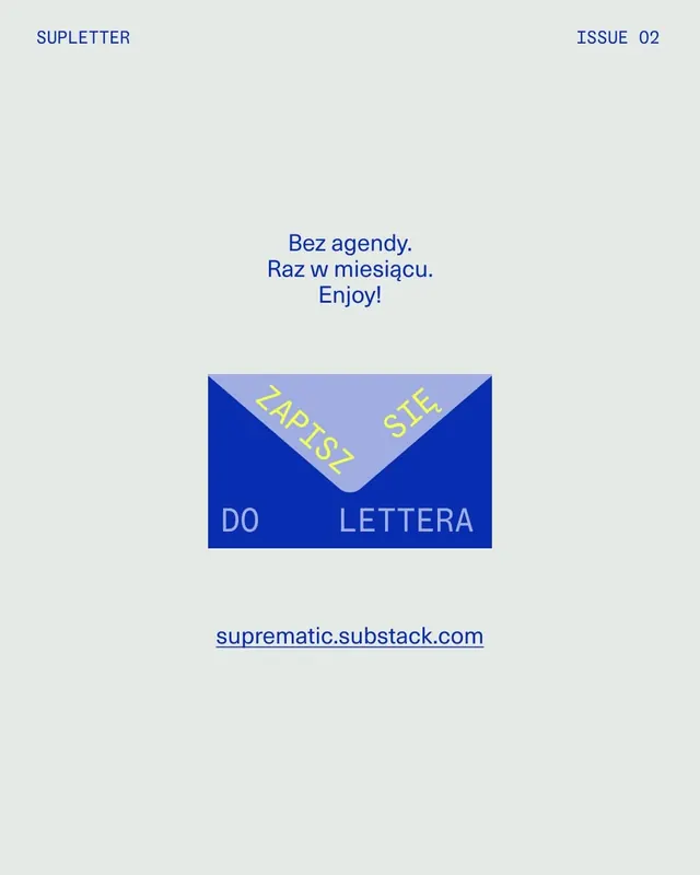
Minimalist newsletter cover using asymmetric layout with deep blue block, illustrated envelope, and centered Polish-language text on light gray.
Summary
Minimalist newsletter cover using asymmetric layout with deep blue block, illustrated envelope, and centered Polish-language text on light gray.
Visual description
Light warm-gray background with minimal visual weight. At top left, blue uppercase header "SUPLETTER" and top right "ISSUE 02" in matching blue sans-serif. Centered vertically is a three-line sans-serif message in blue: "Bez agendy. Raz w miesiącu. Enjoy!" Below, a geometric illustration of an envelope in deep blue and lavender with yellow-green text on the flap reading "ZAPIS" and "SITE," and white text on the lower portion "DO LETTERA." At bottom center, a hyperlink to "suprematic.substack.com" in blue. The entire composition balances whitespace and a single illustrative element, emphasizing typography and clarity.
Key takeaway
The asymmetric envelope illustration as a focal point breaks the typographic grid without adding visual noise. Text floats in negative space around the central graphic. The color palette (light neutral + saturated blue + accent yellow) creates sophisticated contrast without being loud. Newsletter branding achieves personality through illustration and hierarchy alone.
Reuse notes
Effective for publication or newsletter launches, subscription calls-to-action, and digital media covers. The illustrated element needs to anchor the layout without competing with the type. Works best when the audience can parse the typography first, the image second.
More like this
Keep what you find
A free account saves references to boards and can send you a weekly email of picks based on what you save.
To see every result, go Pro.