Preview image. Unlock full-res
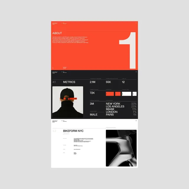
Portfolio case-study layout split into hot red-orange and deep black zones, with oversized white geometric shapes, high-contrast metrics, and a portrait photo anchoring the narrative flow.
Summary
Portfolio layout using a sharp red-orange and black color split, with large white geometric numerals, numerical KPIs, and a striking portrait with orange accent to tell a cohesive brand story.
Visual description
The layout divides into three horizontal tiers. The top third is a vibrant red-orange field with an angular white geometric shape (the numeral "1") occupying the right side, with accompanying descriptive copy in cream text top-left. The middle section uses deep black as the dominant color and presents a structured metrics grid: a large "4:1" ratio marker, followed by a section titled "METRICS" with four columns of data (2.1M, 55K, 12, 72K, 3M) and a portrait photo of a person in black with a bright orange accent stripe across the eyes. The bottom tier returns to white/light gray with "BIKEFORM NYC" branding, accompanied by product photography showing a sleek bike component against black. All typography is clean sans-serif, precisely aligned to a grid.
Key takeaway
The bold color-block approach (red/black/white) creates instant visual momentum and mood separation without decoration. The oversized geometric shapes (the numeral) guide the eye naturally while remaining functional. Layering a portrait photo into a data section makes quantitative claims feel human and credible. Consistent grid structure keeps the layout sharp despite the color drama.
Reuse notes
Ideal for tech/startup portfolios, product case studies, or fitness/performance-focused brands wanting a strong, confident voice. The red accent works particularly well when the brand is energetic or performance-oriented. Ensure the portrait photo is high-quality with strong contrast so it reads crisply against the dark background. Works at both large (printed poster) and small (web) scales.
More like this




Keep what you find
A free account saves references to boards and can send you a weekly email of picks based on what you save.
To see every result, go Pro.