Preview image. Unlock full-res
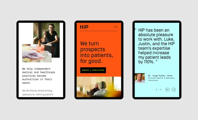
HIP medical services branded triptych balancing photographic documentation on the left, bold typographic statement in the center, and patient testimonial on the right.
Summary
A three-panel case study composition for HIP medical services: documentary photograph left, mission statement center, and patient testimonial right, anchored by a bright orange accent bar.
Visual description
Three black-bordered rectangular panels sit side by side on a light gray background. Left panel: professional photograph of medical professionals with a patient in a clinical setting, copy below ("We help independent medical and healthcare authorities..."). Center panel: bright orange background with large white sans-serif headline "We turn prospects into patients, for good" and a dark blue button labeled "Request a consultation". Right panel: soft cyan-blue background with patient testimonial quote ("HIP has been an absolute pleasure...") in dark type, a small circular patient photo top-right, and icon controls bottom-right (heart, message, share). The orange bar unifies the triptych and signals the primary brand action.
Key takeaway
The triptych structure lets you present three narrative moments (proof via image, value proposition via copy, social proof via testimonial) in balanced visual weight. Black panel borders create container clarity without a grid. The orange accent bar acts as a visual anchor and calls attention to the primary CTA without dominating the composition.
Reuse notes
Effective for healthcare and B2B services marketing where you need to show: clinical credibility, value message, and patient outcomes. The modular three-part structure adapts well to different content (process steps, team member profiles, service tiers). Works best when the central panel message is short and bold.
More like this



Keep what you find
A free account saves references to boards and can send you a weekly email of picks based on what you save.
To see every result, go Pro.