Preview image. Unlock full-res
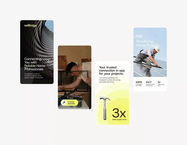
Service-marketplace app UI combining five rounded-card panels with photography, numeric stats, and badge labels across a light background.
Summary
Service marketplace UI featuring five distinct rounded-card panels arranged across a light ground, mixing photography, text hierarchy, and metric callouts to present platform benefits.
Visual description
Left column: black card with yellow-green "netBridge" logotype and white headline/subtext on a dramatic diagonal-line texture. Center: tall card showing man installing something, with a yellow pill badge reading "Furniture Specialist" at the bottom. Center-right: white card with bold headline "Your trusted connection in app for your projects," three right-aligned metric badges (100%, 24/7, 3x) in black type, and a lime-yellow rounded rectangle at the base with a hammer icon and bold "3x" text. Right column: light-blue card showing a roofer against sky, "n.e" logotype and "Simplifying Home Projects" in light sans-serif. All cards have consistent rounded corners; photography fills the space without letterboxing; typography is clean and legible at scale.
Key takeaway
The card-based metric presentation (100%, 24/7, 3x) stacked vertically on the right, each line clearly separated. The contrast between image-filled cards (photography) and text-only cards (white space with bold hierarchy). Badge labels pinned to card bottoms as contextual tags. Lime-yellow highlight color used sparingly for emphasis (the "3x" box).
Reuse notes
Strong for service marketplace, contractor, or on-demand professional platforms. Works well when you need to stack multiple value propositions (features, stats, credibility signals) in a compact footprint. The photograph-plus-label pattern scales to any professional service vertical. Caveat: the yellow accent is high-saturation; tone it down if the brand identity is more neutral.
More like this







Keep what you find
A free account saves references to boards and can send you a weekly email of picks based on what you save.
To see every result, go Pro.