Preview image. Unlock full-res
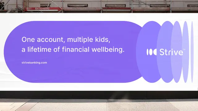
A fintech brand hero featuring oversized purple gradient blob with white text and stacked geometric circles as accent elements.
Summary
A fintech brand hero with an oversized purple gradient blob containing white display type, flanked by stacked geometric circles that suggest sound or motion.
Visual description
Purple and lavender gradient organic blob shape dominates the center, holding white sans-serif display text "One account, multiple kids, a lifetime of financial wellbeing" in a contemporary, modern font. The blob has soft, flowing edges that suggest fluidity and approachability. To the right sits the Strive logo next to a stack of 4-5 circles in varying shades of purple, arranged vertically in a repeating pattern that implies rhythm or acoustic energy. The entire composition sits against a light background with a thin black header bar at the top, suggesting this is a cropped hero section. The color story pairs cool purples and lavenders with white space for high contrast and readability.
Key takeaway
The soft gradient blob as a text container is distinctive and friendly without losing professionalism. The stacked circles echo the messaging (multiple kids, repeated account usage) while adding geometric intrigue. The white text on vibrant purple maintains strong contrast despite the busy gradient beneath.
Reuse notes
Strong for any fintech brand targeting families or multiple users. Works particularly well when the messaging includes repetition or plurality. The blob's flowing shape softens corporate tone while the solid primary color keeps it credible for financial products.
More like this



Keep what you find
A free account saves references to boards and can send you a weekly email of picks based on what you save.
To see every result, go Pro.