Preview image. Unlock full-res
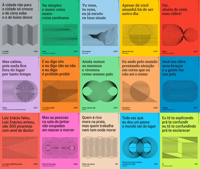
A 4x5 grid of book covers using minimal geometry, oversized sans-serif type, and a high-saturation color palette across isolated text blocks.
Summary
Twenty covers arranged in a rigid grid, each with a single bold word or phrase in a large display typeface set against a flat geometric shape or landscape, with one saturated accent color per cover and mostly white or light gray backgrounds.
Visual description
A 4x5 grid of uniformly sized book cover mockups on a white grid background. Each cover contains one or two lines of large, heavy sans-serif type (uppercase and mixed case) positioned to sit on, overlap, or interact with a geometric form—circles, diagonal lines, wavy shapes, circles with spokes, abstract landscapes. Color is applied in discrete blocks: one bright accent (magenta, teal, coral, yellow, blue, forest green) per cover, often as a shape behind the type or filling the background. Line art elements (simple geometric line-work, minimalist illustrations) appear on some covers, suggesting concepts like thought, structure, or natural forms. The palette alternates between saturated and muted tones, creating rhythm across the grid.
Key takeaway
The grid as a display system for typographic variety while maintaining visual unity through strict sizing and baseline alignment. The freedom of each cover to explore a single color + geometric form pairing without losing cohesion. Oversized type as the main carrier of concept and visual weight.
Reuse notes
Strong reference for editorial layout, type-forward book or poster series, exhibition catalogs, or design system showcases. Works best when the type and geometry do real interpretive work (not decorative). The grid is authoritative and suits self-help, architecture, or cultural publishers.
More like this




Keep what you find
A free account saves references to boards and can send you a weekly email of picks based on what you save.
To see every result, go Pro.