Preview image. Unlock full-res
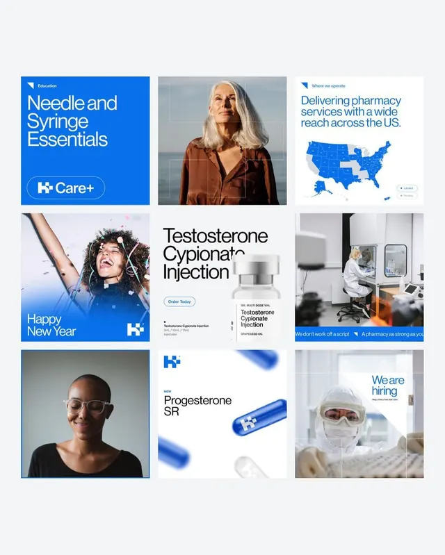
Healthcare brand K+ portfolio presented as a 3x3 grid mixing educational copy, professional photography, maps, and product shots on light background.
Summary
Healthcare brand K+ presented as a 3x3 portfolio grid combining product education, patient/staff photography, service maps, and direct messaging on a clean white background.
Visual description
A 3x3 grid layout on light gray background. Top-left quadrant shows a bright blue educational card with white sans-serif type and K+ logo (Needle and Syringe Essentials). Center-top is a portrait photo of an older woman with white hair in brown clothing. Right-top shows a U.S. map in blue with text about pharmacy reach. Lower-left is a holiday promotional image with person wearing wireless earbuds and blue text (Happy New Year). Center is product-focused content for Testosterone Cypionate Injection with sans-serif type and product vial. Lower-right shows a clinical photo of someone in lab coat and safety gear with "We are hiring" message. Bottom-left shows a closeup portrait of person in glasses. Center-bottom features the product blue capsule/pill shape with sans-serif type. Bottom-right has another staff photo with text overlay. The brand color is a strong electric blue; body text and accents in sans-serif for clarity.
Key takeaway
The grid layout creates visual rhythm and allows diverse content types (photography, graphics, product shots, messaging) to coexist. Strategic use of one brand color (bright blue) ties disparate imagery together. Clean sans-serif type and ample white space keep dense health-care information legible and trustworthy. The mix of human portraiture and clinical imagery balances human connection with professional authority.
Reuse notes
Effective for healthcare, pharmaceutical, and insurance brands that need to communicate multiple value propositions (education, services, team, products) in a single view. Works on both web and social feeds due to grid structure. The strong brand blue can be swapped for another color but must contrast sharply against the light background. Best used when each grid tile has a distinct narrative (education, testimonial, capability) rather than just repeating the same message.
More like this





Keep what you find
A free account saves references to boards and can send you a weekly email of picks based on what you save.
To see every result, go Pro.