Preview image. Unlock full-res
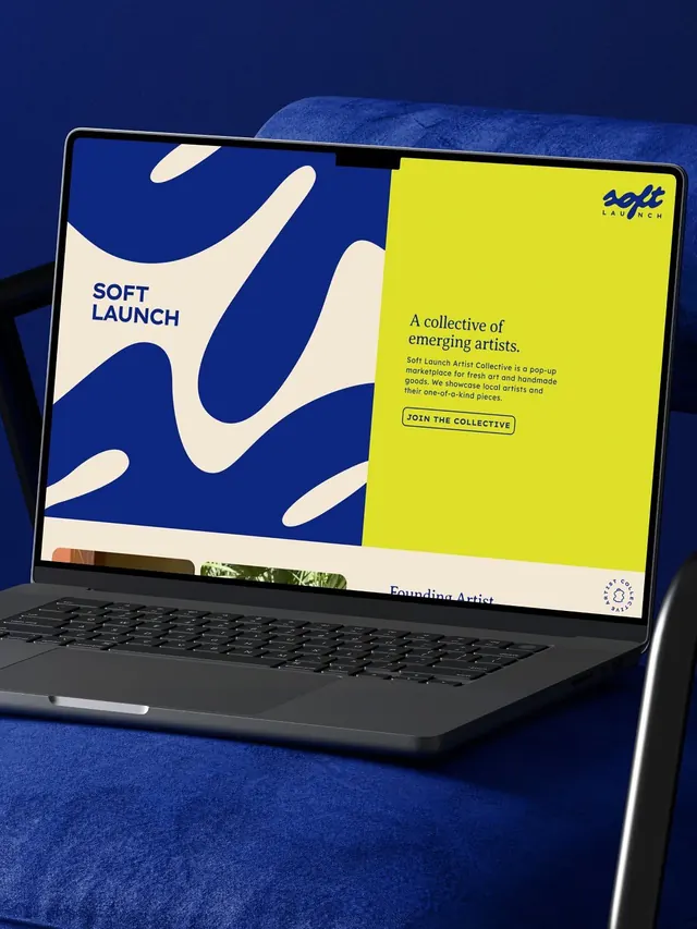
Art collective brand identity with bold blue and yellow split-screen layout, organic shapes on dark blue background, and tagline targeting emerging artists.
Summary
Art collective brand identity split between organic cream shapes on deep blue and a bright yellow panel, displayed on a laptop screen with "Soft Launch" wordmark and "A collective of emerging artists" tagline.
Visual description
A laptop screen sits angled on a deep blue fabric surface, displaying a two-panel layout. The left half is deep blue with white organic, curved shapes flowing vertically. The right half is bright yellow-lime with dark teal text and a black "JOIN THE COLLECTIVE" button. The "Soft Launch" wordmark appears in navy sans-serif on the blue side. A small logo mark sits top-right on the yellow panel. The color contrast is sharp: deep navy, cream, and luminous yellow create high visual impact.
Key takeaway
The split-screen composition forcing a color contrast that reads at thumbnail scale. The organic curved shapes grounding the blue side, making it feel less rigid. The single bright accent color opposite a saturated dark creates immediate hierarchy and emotion.
Reuse notes
Strong for art, design, or startup portfolios needing to project boldness and emerging energy. The palette works best in print or web hero sections. Yellow readability is excellent on the deep blue but less accessible on light backgrounds, so reverse the palette for softer brands.
More like this



Keep what you find
A free account saves references to boards and can send you a weekly email of picks based on what you save.
To see every result, go Pro.