Preview image. Unlock full-res
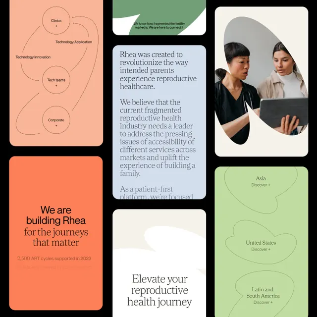
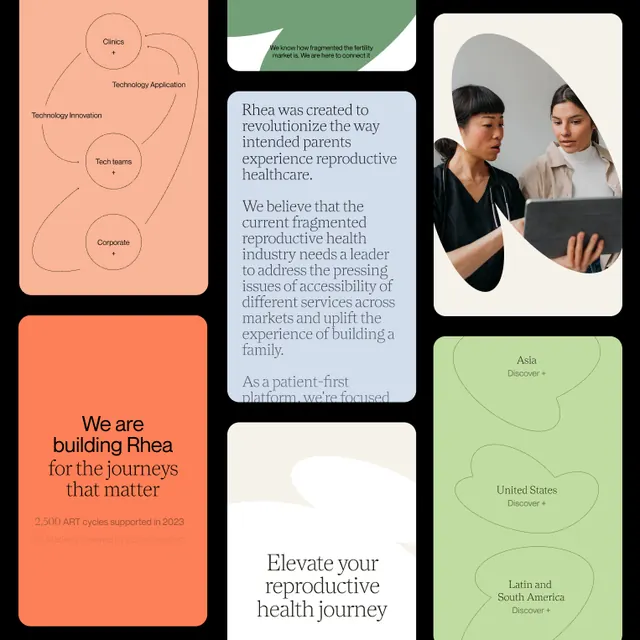
Warm healthcare brand identity suite for Rhea, a reproductive health platform, using sage green, coral, and cream in an asymmetrical card-based layout.
Summary
A warmly designed healthcare brand presentation for Rhea, a reproductive health platform, composed of overlapping cards in sage green, coral, and cream with embedded lifestyle photography and circular diagrams.
Visual description
A multi-card layout arranged in an asymmetrical grid against a white background. The left side features a cream-colored card with hand-drawn circular diagrams and labels (Cycle, Symptoms, Diagnosis). A large coral-orange card dominates the lower left with the headline "We are building Rhea for the journeys that matter" in off-white sans-serif. The center shows a sage green card with condensed body text and mission language. A circular photographic cutout of two smiling women in professional casual attire occupies the center-right. The right side has a pale green card with geographic labels and axis lines (Asia, Europe, United States, Latin America, Africa). All cards have soft shadows and generous whitespace between elements. The palette uses warm, desaturated tones and the overall composition feels approachable and inclusive.
Key takeaway
The combination of illustrated diagrams (circular systems), lifestyle photography, and typographic cards in a single composition without feeling cluttered. The color palette of sage and coral as complementary but warm and professional. The use of geographic or data-adjacent circular diagrams paired with human imagery to convey both clinical credibility and human-centered care.
Reuse notes
Excellent reference for healthcare, wellness, and patient-centric SaaS brand presentations. The asymmetric card layout works well when you need to blend diagrammatic / data content with human storytelling. Best suited to contexts where warmth and approachability matter (patient-facing, inclusive services). The palette is particularly strong for reproductive health, mental health, and fitness brands.
More like this





Keep what you find
A free account saves references to boards and can send you a weekly email of picks based on what you save.
To see every result, go Pro.