Preview image. Unlock full-res
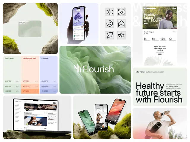
Multi-panel brand identity collage for a health app showing UI mockups, color palette, icons, and lifestyle photography unified by organic textures and a green-and-pink palette.
Summary
Multi-panel brand collage for the "Flourish" wellness app combining product mockups, icon systems, color palette, and lifestyle photography on an organic textured background.
Visual description
A structured grid collage showing Flourish's complete visual identity. Upper left: layered organic textures (moss, leaves, stone) with a rectangular mint-green swatch. Center-left: a mobile UI mockup with purple gradient header and white form elements. Top center: six minimalist icons in black outline (leaf, target, spiral, compass, leaf, plant motif). Top right: two lifestyle photos of people with a health tagline. Lower panels display: an app screenshot detail, the Flourish logotype in white on a large green leaf photograph, multiple phones with the app interface angled dynamically, and additional lifestyle product shots. Color palette swatches at left show Mint Cream, Champagne Pink, Lavender with hex codes (CF5E48, FFF8D3, CCF3F3).
Key takeaway
The three-color palette applied consistently across UI, photography, and typography creates visual unity without monotony. Pairing organic photography with geometric UI mockups and icons shows a modern wellness aesthetic. The grid layout efficiently documents multiple brand touchpoints (app, icons, palette, lifestyle) in one cohesive frame.
Reuse notes
Ideal as a portfolio template or brand-identity case study presentation. Works for health, fitness, nutrition, or meditation apps. The mint-pink-lavender palette appeals to wellness and consumer-app contexts. Best when the lifestyle photography is authentic and the UI mockups are sharp.
More like this

Keep what you find
A free account saves references to boards and can send you a weekly email of picks based on what you save.
To see every result, go Pro.