Preview image. Unlock full-res
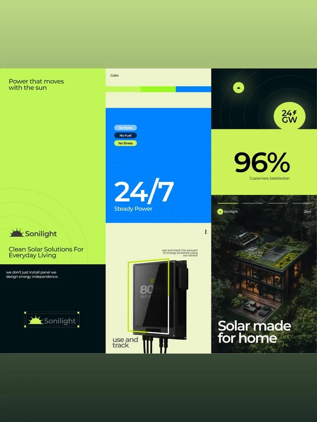
Energy brand website section for Sonilight using lime green and electric blue color blocks, product photography, and oversized statistics to showcase solar solutions.
Summary
A solar energy brand website using a dynamic bento-grid layout with bright lime green and electric blue color blocks, combining messaging, product mockups, lifestyle photography, and oversized statistics.
Visual description
A multi-section layout organized in an asymmetric grid. The top left shows a lime-green background with dark copy: the headline "Power that moves with the sun" and the brand "Sonilight" with a sun icon, plus subheading "Clean Solar Solutions For Everyday Living." The center displays a large electric blue rectangle containing white text "24/7 Steady Power" with three small labels above (No Noise, No Fuel, No Stress). Above the blue block sits a light beige section labeled "Color" with thin lime and blue accent lines. The right side features a dark section with a green circular node diagram centered on a teal/dark background, overlaid with "24+ GW" in lime text, and below it an oversized "96%" in bold black sans-serif on a lime background with "Customers Satisfaction" in smaller type. The bottom half is divided: the left shows the Sonilight logo on dark with a sun icon and supporting tagline; the center shows a product mockup (a black rectangular device with lime accent border) labeled "use and track"; and the right displays a moody photograph of a modern roof-integrated solar installation at dusk with the headline "Solar made for home" overlaid. Throughout, sans-serif typefaces range from headlines in bold display weight to small utility labels.
Key takeaway
The lime-and-blue complementary color contrast commands attention and clearly signals energy/tech innovation. Arranging benefits as labeled badges (No Noise, No Fuel, No Stress) in a small group on a large solid color makes copy scannable without text clutter. Pairing oversized statistics (96%) with photorealistic product imagery builds trust, while the abstract node diagram above adds technical credibility. The bento layout lets diverse content types (copy, statistics, product mockup, lifestyle photo) coexist without borders or cards.
Reuse notes
Ideal for clean-tech, hardware, or energy brands targeting homeowners or small business. The lime green works best in bright, high-contrast contexts; pair with solid color blocks or dark photography to maintain legibility. The layout is desktop-first due to the wide bento grid; consider collapsing to a vertical stack on mobile. Works well for benefits breakdowns, product features, and customer-satisfaction proofs.
More like this





Keep what you find
A free account saves references to boards and can send you a weekly email of picks based on what you save.
To see every result, go Pro.