Preview image. Unlock full-res
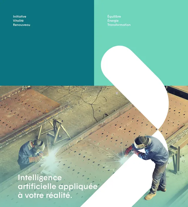
Graphic design with a two-tone color split (teal and mint green) overlaid with an angled white shape and a photo of metalworkers welding, plus French-language typography.
Summary
A French-language corporate poster using a diagonal color block (teal, mint, white) to frame an overhead photograph of two metalworkers welding steel, with stacked sans-serif text in the upper corners.
Visual description
The layout is divided vertically and diagonally: the left half is dark teal with right-aligned white text (three stacked lines); the right half is soft mint green. A large rounded white shape leans diagonally across the boundary, interrupting both color zones. Beneath it sits the overhead photograph of two workers on a perforated metal surface with welding equipment and cables. The entire composition feels structured and precise. Bottom-left corner shows white sans-serif type spelling out French terms for transformation and energy.
Key takeaway
The diagonal white shape acts as a visual anchor without needing imagery; it bridges the two color halves and draws the eye. The teal-to-mint gradient is contemporary and energetic while maintaining professionalism. Overhead/bird's-eye photography humanizes an industrial subject without sentimentality.
Reuse notes
Effective for B2B technology, engineering, or manufacturing brands wanting to convey innovation and precision. The diagonal shape technique works well for splitting messaging (problem/solution, before/after) or layering type over photography. Works across print and digital. Keep the color contrast high for legibility; the mint-on-white text reads cleanly but requires careful size management.
More like this


Keep what you find
A free account saves references to boards and can send you a weekly email of picks based on what you save.
To see every result, go Pro.